
List
Overview
Use lists to display an index or collection of items. A single list item displays all details related to one artifact in the system.
The most common use of a simple list in a summary card is presenting information that is quickly accessible, well-structured, and easy to maintain. For example, a to-do list or an address list.
Example
<List attributes="addressUrl" caption="IDS_ADDRESSES" factory="createFactory" head="true" items="(@ addrs)" name="gridAddresses" order="((name . #t))">
<Menu name="rightClickMenu">
<Item caption="ids.edit2" event="sysProperties" icon="icon md-18 md-18:" name="editItem"/>
<Separator/>
<Item caption="idsa.UIEvents.copyToClipboard" event="copyAddressToClipboard" name="copyAddressItem"/>
<Separator/>
<Item caption="ids.record.remove" event="sysRemove" icon="icon md-18:" name="deleteItem"/>
</Menu>
<Avatars codes="preferredStyle" icons="type icon"/>
<Captions values="name"/>
<Descriptions values="fullName"/>
<Values values="updateDate"/>
<Enabled values="isEnabled"/>
</List>Explanation
The main elements in the code example above are used for the following purpose.
| Element | Description |
|---|---|
List | Binds the list to an attribute of the Portlet class with the items property. |
Menu | The menu specifies the actions that can be performed on the tiles within the lists. The event within the menu is associated with the logic that is triggered within a specified UI Action that is executed on selecting the particular menu item. |
Avatars | Icons that further help to categories items within a list in a more visual format.
You cannot specify both
Avatars and Values. Values will place checkboxes in the same place where Avatars would have appeared.
|
Captions | The primary unit of data presented within a tile of list. |
Descriptions | The description is the supplementary text used to describe the caption values. |
Values | When you add a Values configuration, a checkbox will appear on each tile. Whether the checkbox is checked or not is dictated by the "values" property. |
Enabled | Controls the enablement of the checkboxes. Whether the checkbox is enabled or not is dictated by the "values" property. |
The sample code above generates the following list when Avatars is configured:
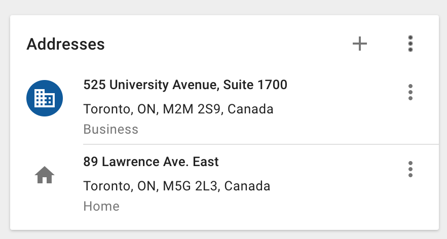
The overflow menu on each list item includes the edit, copy to clipboard, and delete menu items.
The following list example shows configured checkboxes:
Other considerations
Some lists may need to be grouped. For example, you may want to group a list of tasks by date. Use the sections tag to specify the different data groupings that will be used to divide up the data in a list. The value property can be used to configure the business model attribute associated with creating the titles of the different groups of items in the list. The value on the Sections element should generally match the order attribute on the List element. This ensures the order of the items is maintained in the entire list as well as in the individual groupings.
<List attributes="isMarkCompletedEnabled (template (defaultVerb value (action value)))" head="true" items="(@)" name="gridActs" order="(startTime . #f)">
<Sections pattern="date.s.f" values="startTime"/>