UI themes and CSS
Themes allow you to match the application to your UI preferences and standards. This is accomplished with theme files and CSS. The recommended approach is to use the capabilities provided in theme files. This currently includes the ability to specify color palettes, background images, and banners.
Themes require some setup in your project to work. If you haven't done so already, follow these instructions.
Theme files
A theme is simply a property file called mod/themes/<themeName>.theme which contains entries of the form <themeProperty>=<value>. For example, color.back=#EEEEEE. These entries let you override the default look and feel of your application. If a property is not set in the theme file, the default value is used.
Images used in themes are typically saved into a mod/images/<themeName> folder, so they can be referenced as in the following example:
banner.image.default=url(images/mono/page-nav.png)
Themes can be used either by:
- Adding a query string parameter to the application URL, for example,
<root>/ui/portal?theme=mythemeor<root>/ui/portal?theme=subfolder/mythemeif you organize your themes into folders inside themod/themesfolder. - Adding a default theme to the environment file. Simply add a
theme=<themeName>attribute to the root Environment (or Server) element in your environment definition and all users of the application run with that theme, unless overridden in the URL as above.
A good example is the mono theme. So just add ?theme=mono after the url. Note that if your url has a # path in it, the theme querystring parameter needs to come before the #.
Semantic color properties
Semantic colors used in theme files are based on the Material Design color system, which is organized around color usage and palettes. For more information, see The color system - Material Design.
Colors used in palettes are expected to be used in a variety of areas across the application. If a color is not specified in a theme, its default color value is used. The following table shows the name of the semantic colors and their default color values. To override the value for a particular semantic color, take the name from below and create an entry in the theme file of the form color.<lower-case-semantic-color-name>=<color-value>. For example, color.back=#EEEEEE.
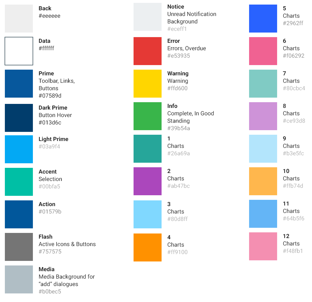
Although each of the semantic color values may be specified in a theme, according to the specification several of them (error, flash) are not recommended to be changed.
To represent the above colors in a theme, you would create the following color properties in your .theme file:
color.back=#EEEEEE
color.data=#FFFFFF
color.prime=#07589D
color.dark=#013D6C
color.light=#03A9F4
color.link=#07589D
color.accent=#00BFA5
color.action=#01579B
color.flash=#757575
color.media=#B0BEC5
color.notice=#ECEFF1
color.error=#E53935
color.warning=#FFD600
color.info=#39B54A
color.1=#26A69A
color.2=#AB47BC
color.3=#80D8FF
color.4=#FF9100
color.5=#2962FF
color.6=#F06292
color.7=#80CBC4
color.8=#CE93D8
color.9=#B3E5FC
color.10=#FFB74D
color.11=#64B5F6
color.12=#F48FB1

color.flatPrime=#FFF
color.primeCaption=rgba(255,255,255,0.7)
color.primeStrongCaption=#FFF
color.primeTitle=#FFF
Additional properties
- font - allows you to override the default primary font name, for example,
font=Courier
Control properties
These theme properties apply to specific types of AFL controls.
- page.drawer.width - the width of the open page drawer.
- page.draweropen.right - when the drawer is open, positions the page to the left of the right edge by the set amount. For example,
page.draweropen.right=310px. - page.nav.image - background image for the page navigator. For example,
page.nav.image=url(images/mono-nav-closed.png). - page.nav.image.open - background image for the open page navigator. If omitted, the open image will default to the one specified in
page.nav.image. For example,page.nav.image.open=url(images/mono-nav-open.png). - page.nav.color - color of the hamburger, workspace icon, and workspace text. Used to improve visibility if the background image is dark, for example,
page.nav.color=white. - page.nav.title.height - provides the ability to nudge the menu down to make room for a company logo, for example,
page.nav.title.height=70px. - banner.background - background color of the cards in the banner.
- banner.badge.background -background color of the badges in the banner. It forms the outline of the badge.
- banner.tile.comment.color - the color of the subtext inside the banner.
- dialog.draweropen.right - When the drawer is open from a dialog, positions the dialog to the left of the right edge by the set amount.
- For example,
dialog.draweropen.right=155px. - gauge.high.color - the color of the gauge in the high area.
- gauge.low.color - the color of the gauge in the low area.
- gauge.medium.color - the color of the gauge in the middle area.
- grid.column.background -the outline color of icons in detail cards. Only affects icons with circular outlines.
- filter.chip.maxLength - the maximum display width for the content of filter chips (the operator and value), for example,
filter.chip.maxLength=280px, which is the default. - filter.chip.selected.borderColor - the border color for the currently selected filter chip.
- schedule.todayCaption.color - the color of today's date in the schedule workspace.
- tab.hover.color -the color of the text when hovering over a tab.
- tab.selected.color - the color of the selected tab's text.
- table.hover.background - the color of a row in the grid during a mouse hover, includes background of the hover toolbar.
- tooltip.backgroundcolor - background color of the non-native tooltip.
- tooltip.color - the text color of the non-native tooltip.
Images may be placed in the meta/images folder or in the mod/images folder. The advantage of the mod/images folder is that a server restart is not required as you work on your theme to refresh what you see in your browser. If you are creating images specific to a theme, you should place them in the mod/images/<themeName> folder.
Banner background image properties
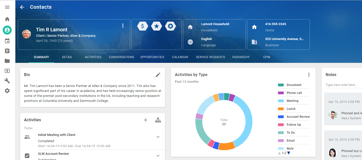
Workspace detail pages often have banners. These banners may have default background images configured in the page definition in the model.
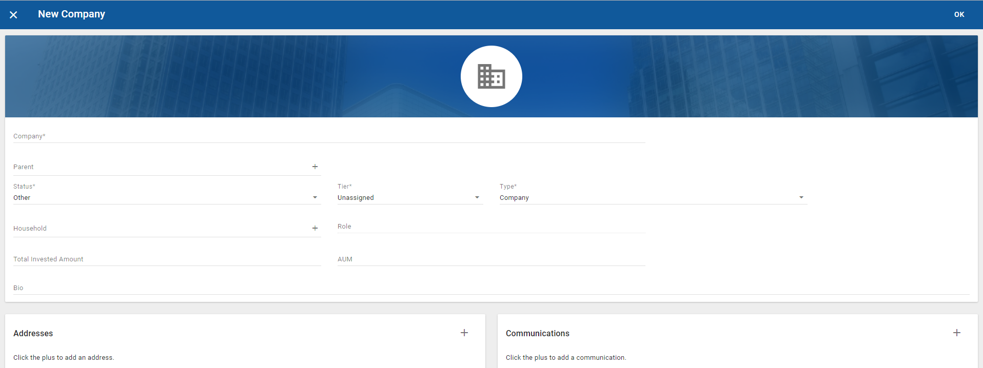
Additionally, create and edit dialogs often have header background images.
The background image of all out-of-the-box page banners may be customized with the following properties:
- banner.image.contact
- banner.image.company
- banner.image.user
- banner.image.opportunity
- banner.image.service.request
- banner.image.approval.plan
By setting these properties to an image from your theme, you may replace the out-of-the-box image, for example, banner.opportunity.image=url(images/mono-opportunity-banner.png). You may also eliminate the background image by setting the banner image property to 'none', for example, banner.opportunity.image=none. In this case, the color.prime color will be used.
Properties for overriding the edit dialog banners are:
- dialog.banner.image.person
- dialog.banner.image.company
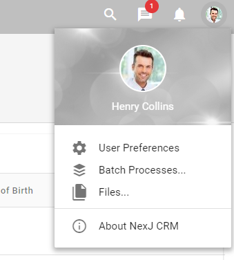
The property for overriding the menu banner is:
- menu.banner
For example, you can change the default blue image in the menu to a grey image that matches your color palette.
You may use the same image for all banners or have a unique image for each banner. You can use macro substitution and the default.banner.image property, such as in the following code:
banner.image=url(images/mono/page-nav.png)

banner.image.contact=none
banner.image.company=$banner.image
banner.image.user=$banner.image
banner.image.opportunity=$banner.image
Mono theme example
To run the mono theme, simply append your browser URL with the ?theme=mono query string. Other themes are terminal and training.
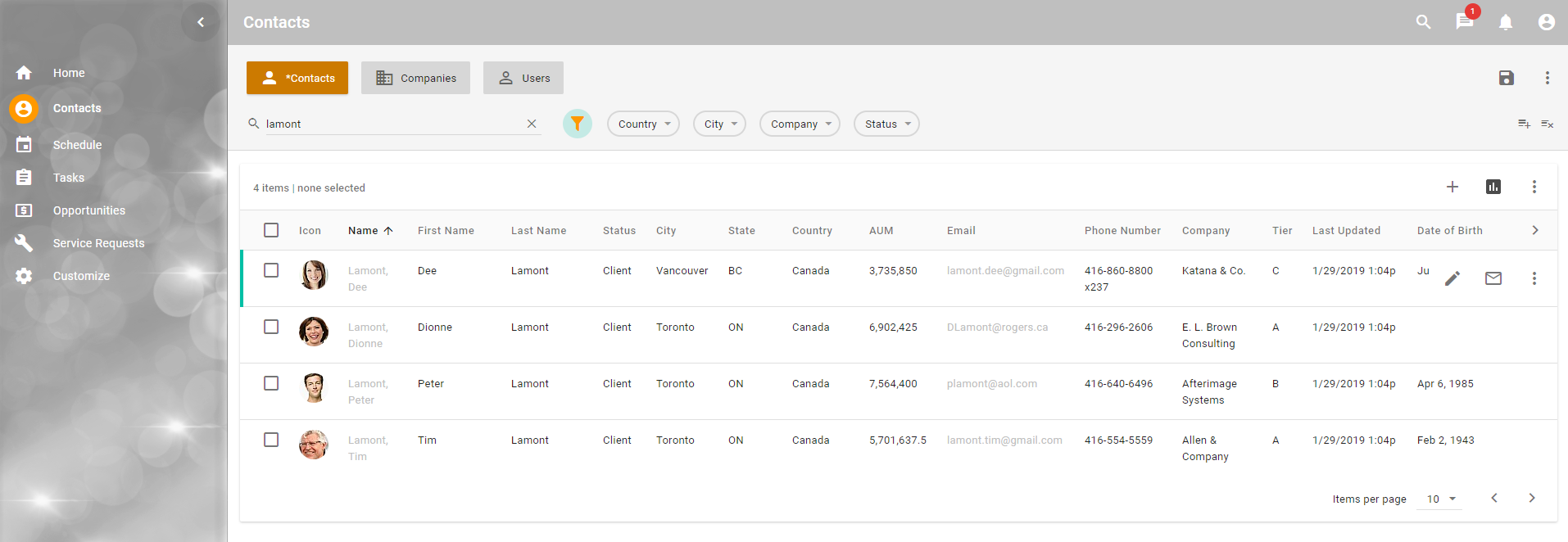
Theme development
Configuring a banner portlet image for use with themes
One of the properties of the banner view is its background image. The image for the banner is set by a DataAction script in your layout that fires the sysBanner event. In the parameters for the sysBanner event, you may provide an image, which could be dynamic based on the type of item you are displaying.
; simple non-dynamic case
(when (= locator 'selection)
   (@ fireUIEvent : "sysBanner"
      (message
         (: caption (inst'fullNameDetail))
         (: image "image:user.png")
      )
   )
)
If you want to make this configurable through a theme, return a style instead of an image as follows.
(when (= locator 'selection)
   (@ fireUIEvent : "sysBanner"
      (message
         (: caption (inst'title))
	     (: style "-banner-mybannertype")
      )
   )
)
Then add a mod/portlet/<ns.BannerPortletName>.css file to your project with a CSS specification like the following:
.-banner-mybannertype {
	background-image: url(images/users.jpg); /*$banner.image.mybannertype*/
}
Here we are tying together the CSS class name banner-mybannertype that we set in the script with a CSS rule that specifies the default background image and a macro that can be set to override the default in a theme file, for example, banner.image.mybannertype.
To override the image in a particular theme, simply specify banner.image.mybannertype to the desired background image for the banner, for example, banner.mybannertype.image=url(images/mytheme/contact.png).
This approach is enabled using a cool feature where you can customize CSS for any portlet by creating a mod/portlet/<ns.portletName>.css file in your project. The colons ":" used to separate namespaces are replaced with periods ".". For example, mda:PersonCreate.portlet would require an associated mod/app/portlet/mda.PersonCreate.css file to load its custom CSS rules.
This approach is very flexible. For example, the following script sets the CSS style (class) based on some condition of the item that the dialog will display.
; or in a case where you want the image to change based on the instance type
(when (= locator 'selection)
   (let ((inst (@ model item))) (@ fireUIEvent : "sysBanner"
      (message
         (: caption (inst'fullNameDetail))
         (:
            style
            (cond
               ((instance? inst UserPerson) "-banner-user")
               ((instance? inst Person) "-banner-person")
               (else "-banner-company")
            )
         )
      )
   )
)
Configuring a dialog portlet image for use with themes
A dialog banner image is usually set in metadata by specifying the image property on the main layout of a dialog. If you want to be able to override this image in themes, you need to inspect the generated markup in your browser to find the name of the layout that hosts the image. You then simply add the following CSS to the mod/dialog/screen/<dialogName>.css file. For example, add the following CSS to the mod/dialog/screen/PersonCreate.css file.
[id='PersonDetail\.mda\:PersonCreate\:1'] .-card-media-image {
	background-image: _ /*$dialog.banner.image.person*/ !important;
}
In this case, we are providing a theme property of dialog.banner.image.person to override the banner background image of the PersonDetail LayoutRef on the PersonCreate dialog.
Designing a custom palette
Use the Material Design Color Tool at https://material.io/tools/color/ to design a custom palette for your application.
- In the Custom tab, pick a primary color and see the dark and light variations of this color.
- Pick a secondary color, which will be used as the accent color. You can see how the combination of the two colors and their variations will appear in an application.
- Map the semantic colors to the theme file by creating entries as
color.<lower-case-semantic-color-name>=<color-value>. For example,color.back=#EEEEEE.
Overriding a style in a specific portlet or dialog
You can be very targeted in CSS customizations you make. Simply inspect the classes used in the portlet or dialog you are interested in, then create a file with the following name:
mod/app/portlet/<ns1.ns2.PortletName>.cssfor portlet overridesmod/app/portlet/<ns1.ns2.DialogName>.cssto dialog overrides
In the file name, the ns1 and ns2 are any namespaces in the name portlet or dialog name, where the colons ":" are replaced with periods ".". Then create specific CSS rules in that file. The CSS will be loaded and applied when the portlet or dialog is loaded.
Overriding CSS globally
CSS changes may have unknown side effects to UI behavior and may affect how UI tests perform, among other things. This approach is not highly recommended. All modifications of this type should be cataloged, and if a re-occurring pattern emerges, the core product CSS should be instrumented to support the pattern using Theme files. In addition, CSS elements, classes, and ids are not guaranteed to remain the same from release to release.
You may apply global changes to the look and feel through standard CSS. This is typically done by inspecting the dom with a developer tool in the browser to see what elements, classes, and IDs are available and how they relate to one another.
Enhancements or overrides may be placed in a mod/app/portal.css file in your project.
For instance, the following CSS adds a "roundness" to the filter buttons:
.-tab-tooled-list > A > LI.-caption, .-tab-tooled-list > A > LI.-icon {
   border-radius: 8px;
}
Which changes...

to...

