
Description
Use buttons to allow users to take actions on any workspace or dialog.
Variations
Both text and icon buttons are supported. Use text buttons in full-screen and popup dialogs, summary cards (lists), and in data tables for batch commands which appear after at least one record has been selected.
Use icon buttons in data tables for row-level and table-level commands, and in the search pattern.
Interactions
Click a button to open or close a dialog, open a menu, or perform other actions.
Specifications
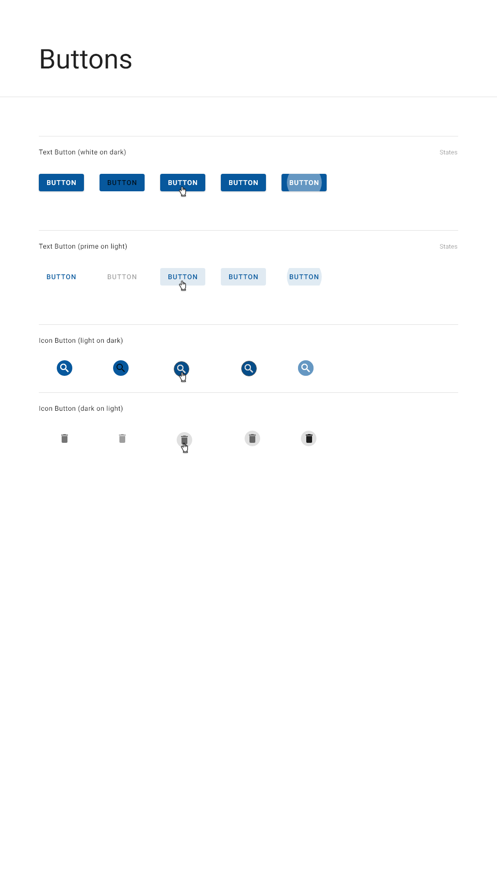
Detailed specifications
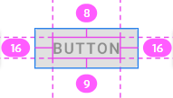
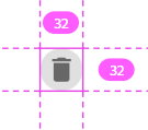
|
Element |
State |
Prime on light - text |
White on dark - text |
White on dark - icons |
Grey on light - icons |
|---|---|---|---|---|---|
|
Text |
Enabled |
Roboto, Medium, 14pt, #07589D |
Roboto, Medium, 14pt, #FFFFFF |
Material-Design-Iconic-Font, 24 pt, #FFFFFF |
Material-Design-Iconic-Font, 24 pt, #000000, 54% |
|
Background |
Enabled |
none |
none |
none |
none |
|
Text |
Disabled |
Roboto, Medium, 14pt, #000000, 38% |
Roboto, Medium, 14pt, #000000, 87% |
Material-Design-Iconic-Font, 24 pt, #000000, 87% |
Material-Design-Iconic-Font, 24 pt, #000000, 38% |
|
Background |
Disabled |
none |
none |
none |
none |
|
Text |
Hover |
Roboto, Medium, 14pt, #07589D |
Roboto, Medium, 14pt, #FFFFFF |
Material-Design-Iconic-Font, 24 pt, #FFFFFF |
Material-Design-Iconic-Font, 24 pt, #000000, 54% |
|
Background |
Hover |
#000000, 12% |
#000000, 12% |
#000000, 12% |
#000000,12% |
|
Text |
Focused |
Roboto, Medium, 14pt, #07589D |
Roboto, Medium, 14pt, #FFFFFF |
Material-Design-Iconic-Font, 24 pt, #FFFFFF |
Material-Design-Iconic-Font, 24 pt, #000000, 54% |
|
Background |
Focused |
#000000, 12% |
#000000, 12% |
#000000, 12% |
#000000,12% |
|
Text |
Pressed |
Roboto, Medium, 14pt, #07589D |
Roboto, Medium, 14pt, #FFFFFF |
Material-Design-Iconic-Font, 24 pt, #FFFFFF |
Material-Design-Iconic-Font, 24 pt, #000000, 54% |
|
Background |
Pressed |
#000000, 12% |
#FFFFFF, 30% |
#FFFFFF, 30% |
#000000,12% |