Application pattern
The Application pattern organizes portlets, which are the basic UI building blocks (such as list, details, cards, charts and graphs) into a familiar structure and a useful application:
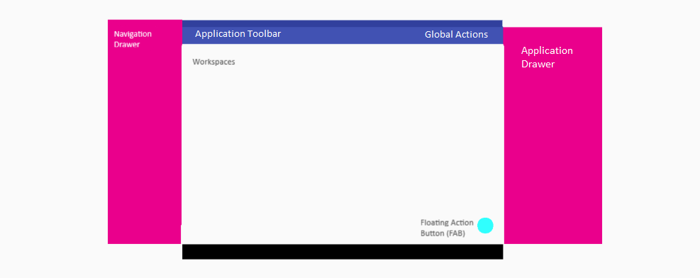
This example is for Tablet structure, but the MODL platform makes the rendering for mobile, tablet, and desktop automatic. You simply specify your design and it will work on the target device. The structural components of an application are as follows:
Portal
--> Workspaces
    --> Navigator (optional list portlet)
    --> Pages
        --> Banner (optional summary portlet)
        --> Tabs (collection of portlets)
--> Drawers
--> Tools (slide-out portlets e.g. notifications)
--> Broker (non-visible portlet for portal UI logic)
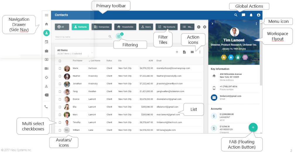
Each of the Navigator, Banner, Tabs, Drawers, some Tools and the Broker are structural references to Portlets (again, the basic UI building blocks). A configured and running application looks something like this.
Portal
A Portal declares an application's structure. Model Server serves the application at *serverRoot*/ui/portal/*portalName*. See https://community.nexj.com/documentation/reference/modl/latest/Portal.html.
Navigation Drawer
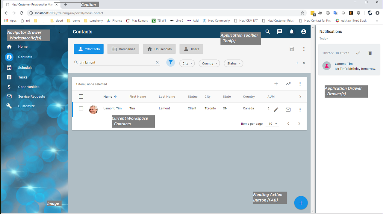
The navigation drawer is automatic. It is populated by the list of workspaces in your portal. It allows users to navigate between different workspaces. For design background, see https://material.io/design/components/navigation-drawer.html. When expanded, the navigation drawer presents the workspaces' names and icons. When collapsed, it just presents the workspaces' icons. In addition, there is hamburger button on the top of the drawer.
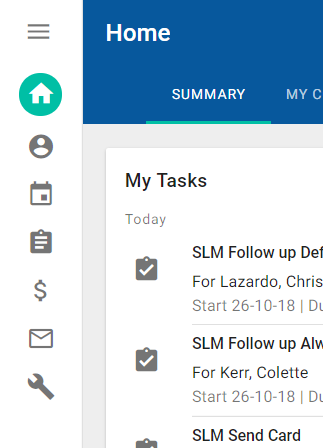
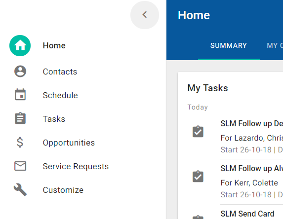
- To navigate to a workspace, click on the workspace name or icon. The icon for the selected workspace is highlighted in the accent color.
- To expand a collapsed drawer, click the hamburger icon.
- To collapse an expanded drawer, click the left arrow icon.
Workspaces
A Portal Application contains a set of workspaces each of which declare the interface content, layout, and behavior for an application feature. See https://community.nexj.com/documentation/reference/modl/latest/Workspace.html.
There are essentially three different types of workspaces:
- Dashboard Workspaces - collection of cards presenting summary information, optionally organized into tabs. For example, Home.
- Navigator Workspaces - a data table with filtering with navigation to a detail page that contains a banner portlet and a collection of cards, optionally organized into tabs. For example, Contacts.
- Special Workspaces - something that isn't a dashboard or navigator workspace 🙂 . For example, Schedule or Reporting.
- Administration Workspaces - collection of data tables in tabs without detail views for administrative maintenance. For example, Customize.
Dashboard and administration workspace patterns are essentially a collection of Cards whose patterns are discussed in the Cards section <link>. The navigator workspace pattern deserves special treatment and its components (Navigator and Banner) are discussed in their own documents.
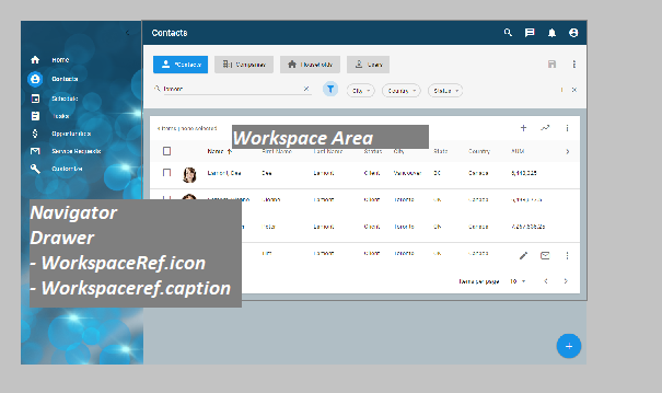
Each workspace has its own arrangement of portlets based around a particular business function. Workspaces may be accessed directly from the Navigator Drawer or may present drill-down information from other portlets, such as Contact > Accounts > Holdings/Transactions where Contact is a top-level workspace with an accounts list, which can further navigate to a sub-workspace for holdings. A workspace can simply have a set of one or more tabs with portlets in them, such as the Home workspace, or can have a navigator portlet, such as the Contacts workspace.
Workspaces are composed of the following components, some of which are optional to support the different workspace types (dashboard, navigator, admin).
Navigator (list portlet)
The navigator is an optional workspace element referencing a portlet that implements a list pattern. See https://community.nexj.com/documentation/reference/modl/latest/Workspace_Navigator.html.
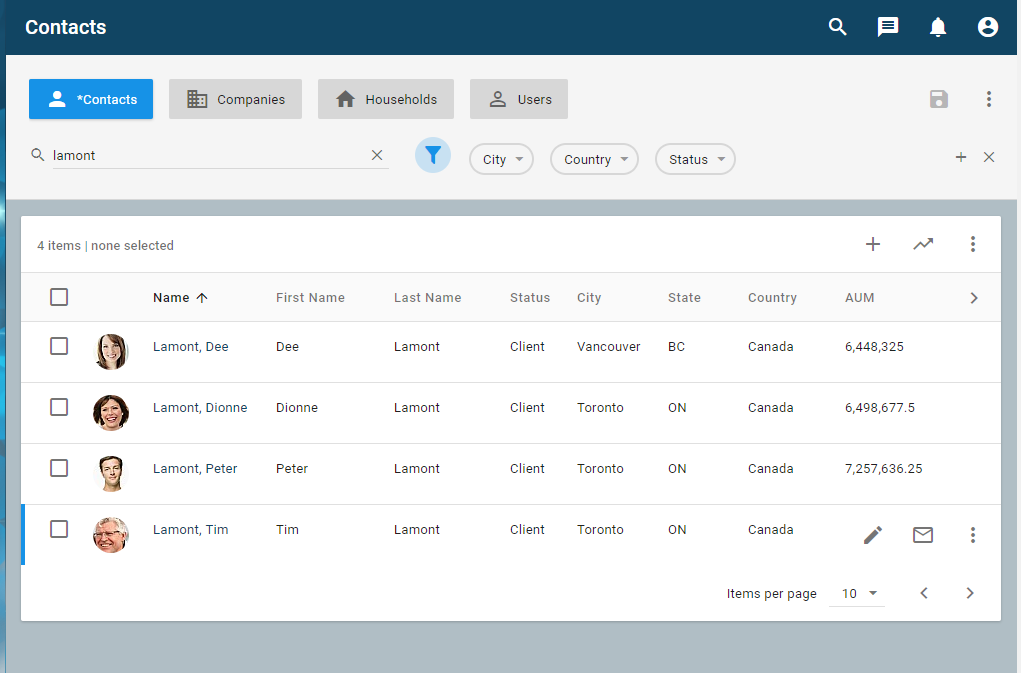
When an item is clicked on in the list, the local context is set to that item and a detail page is displayed. The page.case property may be used to conditionally display an appropriate detail page for the selected item.
Pages
Detailed content is presented in one or more Pages. See https://community.nexj.com/documentation/reference/modl/latest/Workspace_Page.html.
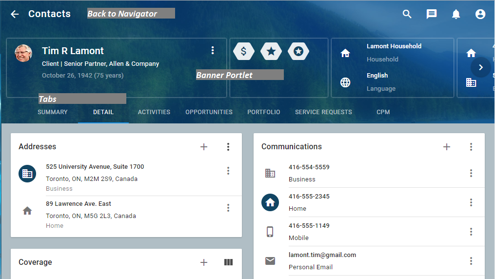
A page has an optional banner and a collection of Tabs. The banner refers to a summary banner portlet, and the tabs can contain various different types of portlets for different purposes.
Banner (summary portlet)
An optional reference to a summary style portlet for a given page as seen in the diagram above. See https://community.nexj.com/documentation/reference/modl/latest/t_PageType_Banner.html.
Page Tabs (detail portlets)
A page may contain any number of tabs to present and group portlets as seen in the diagram above. See https://community.nexj.com/documentation/reference/modl/latest/t_PageType_Tab.html.
Drawers (slide-out portlets)
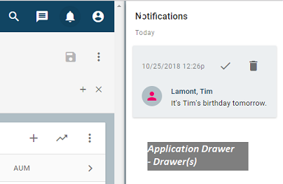
Drawers can slide in and out and remain visible until closed (for example, the Notifications drawer). These are simple references to portlets that are displayed in the Application Drawer area, along with the events that will show or hide them. In desktop mode, when activated, these remain visible even when navigating from workspace to workspace. See https://community.nexj.com/documentation/reference/modl/latest/Portal_Drawer.html.
Actions and Global Actions (Tools)
Tools appear in the Global Actions section of the Application Toolbar. Simply add a Tool element to your Portal application. When a user clicks on a tool, it raises a UI Event which is handled by the framework or by configured UI Actions. See https://community.nexj.com/documentation/reference/modl/latest/Portal_Tool.html.

There are also workspace actions that can show up on buttons, lists, and in the floating action button (FAB) in the bottom right-hand corner (in the general case - it may be in a different location for different locale settings).


For background information, see https://material.io/design/components/app-bars-top.html.
Dialogs
These actions may be used for pretty much anything, including displaying a full-screen or partial screen dialog, as with the edit FAB button on the Contacts workspace.
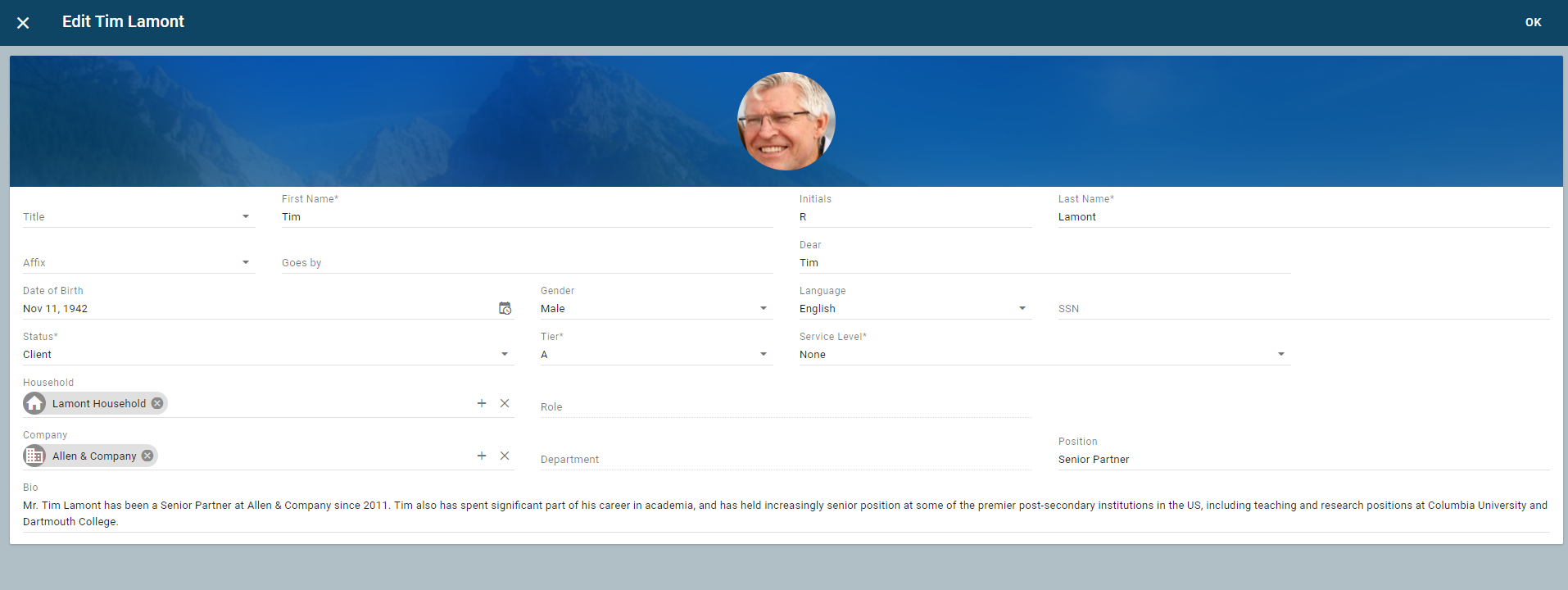
Dialogs can pop up full screen, or on top of other content, for adding, editing, providing, or collecting information. See https://community.nexj.com/documentation/reference/modl/latest/Dialog.html.
Context bus
Another important application pattern concept is the context bus. Each workspace has a set of local context variables. They have a name, like EntityId or OpportunityId, and a current value. Portlets are not aware of each other except through the context bus. Here they can exchange information about the current context and events. There are also events associated with these contexts that are broadcast when, for instance, a context is changed. Global context is a set of variables available throughout the application. Portlets set, and listen for, changes in context variables that they are interested in. In addition, there are context events, which allow one portlet to broadcast an event with parameters, and any other portlet that is interested can respond to that event. This approach allows portlets to be designed with very little knowledge of other portlets, resulting in more flexibility and better maintainability.
Broker (non-visible portlet for portal interface logic)
A reference to a portal that is not visible, but provides orchestration and state capabilities to the portal application. For example, when you click the View All button on the My Tasks portlet on the Home workspace, a navigate event is fired through the context bus. The broker portlet hears the event and handles it by navigating to the Task workspace See https://community.nexj.com/documentation/reference/modl/latest/Portal_Broker.html.
