Full screen dialog
Description
Use full screen dialogs to add or edit records in the system.
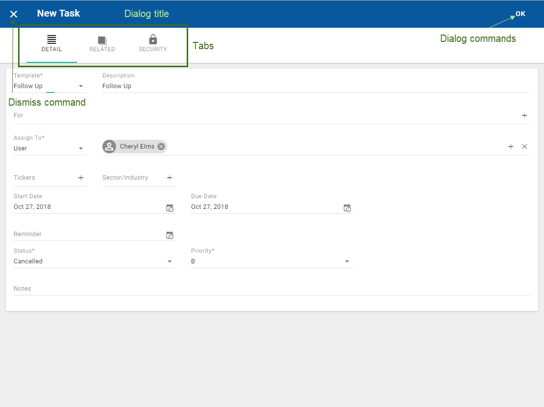
Each dialog contains the dismiss button in the top left corner, a dialog title, one or more dialog commands in the top right corner, and cards containing input fields.
Optionally, a dialog can also include tabs. If the dialog has tabs, then the tab name is indicated with both an icon and a title. The active tab is highlighted.
Annotated Example

When to use
By default, add/edit dialogs are full screen dialogs, with the following exceptions:
- If the dialog is opened from another full-screen dialog, it should be a popup. (If the popup is opened from another dialog and has lots of fields, consider that another tab on the same full screen dialog might work better.)
- If the dialog has very few fields and is displayed on desktop, it should be a popup. The limit for "very few fields" is 8 fields.
Variations
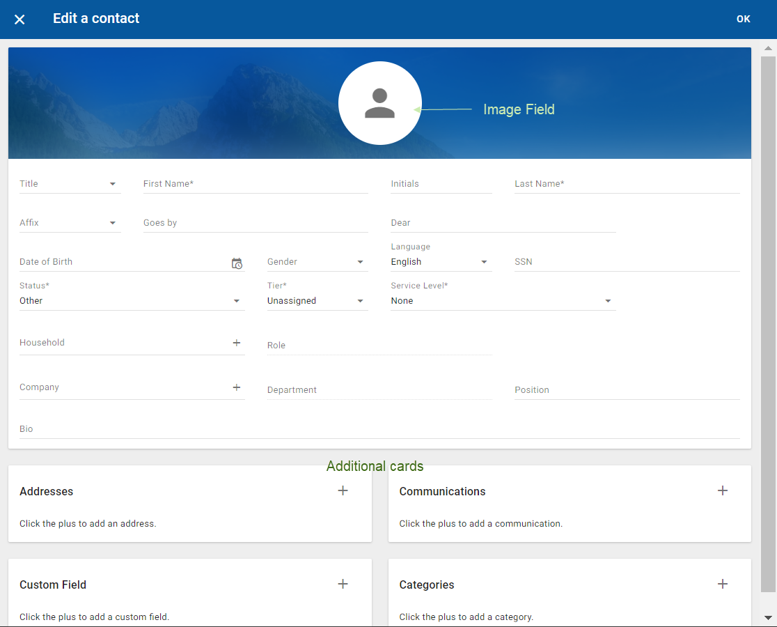
More than one card can be included in the full screen dialog. In this case, each card must include the card title.
If no additional tabs are included in the dialog, then no tab titles are required, not even for the single active tab.
A separate card for adding an image to an object can be included.

Interactions
Dismiss button
On click, close the dialog. If any changes have already been made, on click open a confirmation dialog to validate that the changes should be discarded.
Tabs
To navigate between the tabs in the dialog, click on the tab. Any fields already completed will be retained.
Dialog commands
Complete the fields in the dialog and click OK or the appropriate dialog command.
Additional reference
DIalogs (Full-screen dialog) - Material Design
