Banner
Description
Use the banner on the top of a detail view to display basic details about a record. When navigating between different tabs, the banner remains consistently displayed.
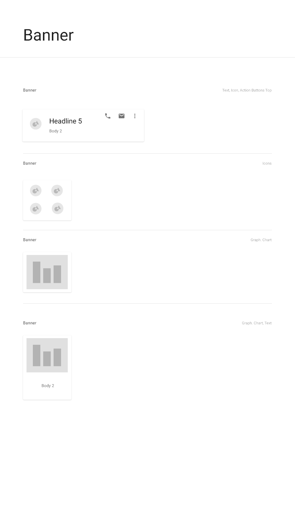
The banner consists of different combinations of cards with two-line tiles and three-line tiles.
When to use
Use in detail views to display information about an object. If a workspace has a detail view, then the detail view should include a banner above the other information.
Variations
The contents of each banner depend on the object and the context.
Mini-card components
Main three-line tile card
Only one main three-line tile is included in the banner. If there are any object-level commands, then this tile is required. It contains the following:
- Large avatar or icon for the subject of the detail view.
- Three lines of text describing the content. If more than one piece of information is displayed on a line, the pieces of information are separated by a vertical line ( | ).
- An overflow menu containing commands which are contextually appropriate to the workspace as well as the specific item.
Badge card
Contains badge icons. The card is two badges tall and can be as wide as needed to accommodate the required badges, to a maximum of 6 badges.
Two-line tile card
Each card contains two-line tiles, with an icon, the value, and the value description below.
Interactions
There are no banner-level commands, but cards within a banner can have associated commands. As a rule, the first banner card is a three-line tile and it has an overflow menu containing contextual command in the top left corner.
If the contents of the banner exceed the size of the screen, you can scroll to the right and the left using the right and left arrows.
Example

Specifications

