Lists
Description
Lists are used to display an index or collection of items. All related details about a list item are displayed in a single tile.
The most common use of a simple list in a summary card is presenting information that is quickly accessible, well-structured, and easy to maintain. For example, a to-do list or an address list.
Annotated example
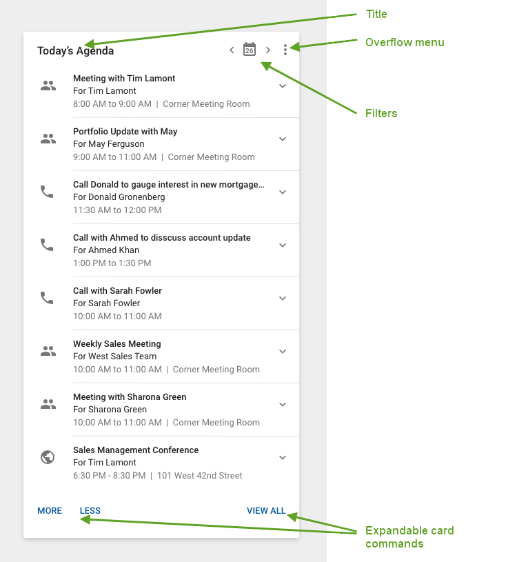
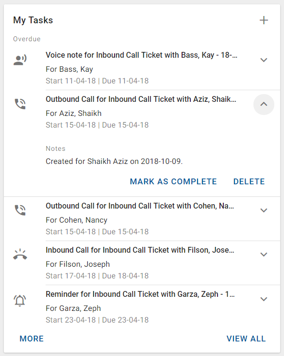
List displayed in a card
Card-level commands are represented by icons located on the top right corner of the card. If only one or two commands are available then you can display the icon for those commands. If more than two commands are available, you can display the overflow menu icon and associate the commands with the menu items in the menu. Exception: If the Add command is available, it is always displayed independently and not included in the overflow menu.
List item (tile)
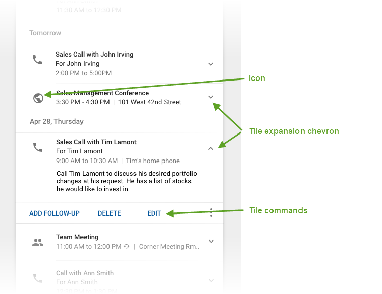
The icon is located to the left of the text in the tile. The icons are grey by default, but they may be highlighted when the item associated with the icon meets certain criteria. For example, overdue tasks in a task summary card may be highlighted. In this case, highlighting adds a red circle around the icon and the icon color changes to white.
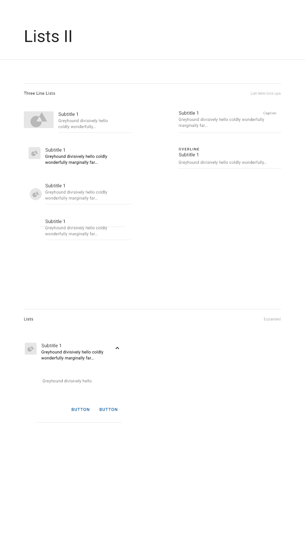
When a tile has associated commands, they are displayed on the bottom of the tile as buttons. Only two commands should be displayed. If additional commands are required, they may be included in an overflow menu.
Tile expansion chevron
The chevron points down when the tile is collapsed and points up after it has been expanded. Click the chevron to expand or collapse the tile.
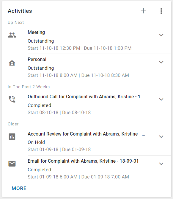
Variations
This is an example of a summary card with expandable multi-line tiles with associated commands.
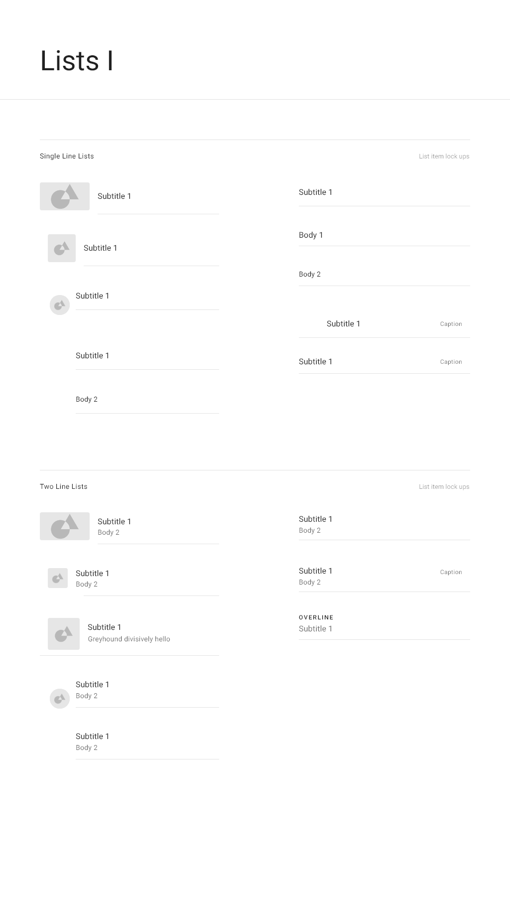
One line or multi-line tiles
Use one line tiles when only a small amount of information needs to be displayed. In this case, there is no rule between tiles. Other possibilities are two line and three line tiles when they are collapsed.
Expandable/collapsible or non-expandable tiles
Use expandable tiles when additional information can be displayed for each list item but is not required for the overview, especially if the additional information may be of varying size. This is normally the Notes field, for example for a task or a contact.
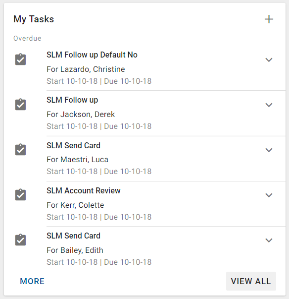
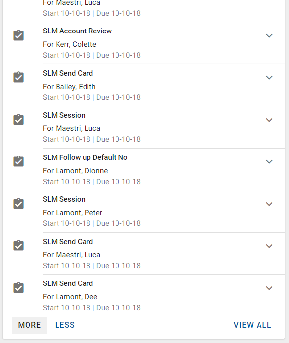
Tiles with or without associated commands
If the items in the list are only informational, then the tile does not contain any associated actions. If there are actions that can be performed on the list items, such as being able to edit or delete it, then action buttons are located on the bottom of the tile.
Grouped list or flat list
Display a grouped list when the items in the list can be separated into logical groups. For example, you can group schedule items by start date. Otherwise, display a flat list.
Grouped lists help to easily view and summarize important items within each category. They also provide a more visual representation of timelines.
When tiles are grouped, the title for each grouping is required.
Interactions
Expandable list functionality for summary cards
If there are additional items that can be displayed in the list, then the MORE button is displayed on the bottom left of the card. Optionally, the VIEW ALL button is displayed on the bottom right of the card.
MORE: Use when additional items can be displayed in the summary card. Expands the card height to accommodate 10 more list items (or as many as necessary if the number of remaining list items is fewer than 10). The LESS button appears on the bottom left of the card, to the right of the MORE button. The MORE button should disabled when no more items can be loaded. If the maximum limit of 300 items has been loaded, then the MORE button should not be displayed.
- VIEW ALL: Use when there is a workspace or workspace tab that is associated with the information included in the list. Displays the workspace associated with the list items.
Specifications