
Picker dialogs
Description
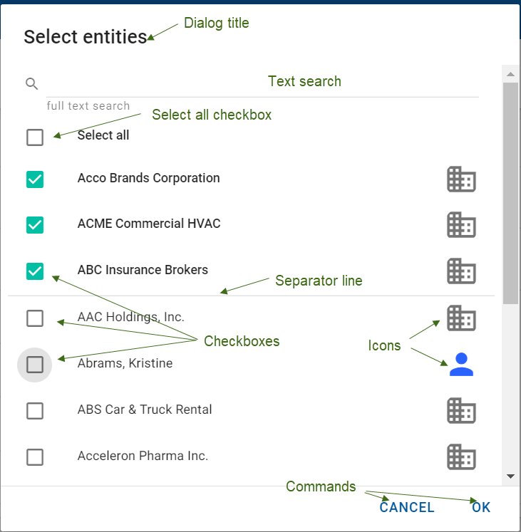
Use these dialogs to allow the user to select multiple values using checkboxes or a single value using radio buttons, from a list of all available values.
Each picker dialog has a mandatory title, which should be in the "Select X" format. For example, "Select Custom Fields" and not "Custom Fields". Each picker also has a mandatry text search field. The ghost text is "Search" by default or "Search name", "Search description", etc, as appropriate. The search icon is displayed at the left of the text field.
Annotated Example
MM picker dialog
Variations
One or more of these variations can be included in a picker dialog to suit it to the context. The following example is an M1 picker which has 3-line tiles and the ability to add a new object.
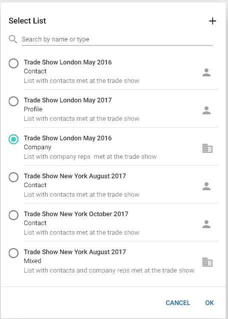
M1 pickers
If only one value can be selected, use radio buttons instead of checkboxes. In this case, the Select all checkbox is not applicable.
On clicking a radio button, the selected value remains in its location in the list.
Icons or avatars
Use an icon for values that have an associated icon in the system. For example, action items. Do not use an icon for entities that exist outside the system. For example, cities. For value types that have avatars (contacts, companies, households), use the avatar instead of the icon.
Tiles
You can use 2-line or 3-line tiles instead of single values in the list.
Adding a new selected value
Where applicable, include the ADD ANOTHER button to the left of the CANCEL and OK buttons. This command saves the value the user picked and re-opens the dialog so the user can pick another value.
Creating a new object
Where applicable, include the plus sign (add) icon on the top right corner. This command opens an add/edit popup dialog to create another new instance of the object. For details, see Small Dialogs.
Grouped values
Values can be grouped. In this case, the group title is displayed above the values and values are alphabetically sorted within the group. After being selected, the value moves to the top of the picker, where it is not grouped but listed alphabetically.
Interactions
The size of the picker dialog does not change depending on the number of values. The scrollbar allows you to scroll through the displayed values. To display more values, click the MORE button. To display fewer values, click the LESS button.
Click a checkbox the select the value. The selected values move to the top of the dialog, above the separator line, where they are also listed in alphabetical order.