
Data tables
Description
In combination with search functionality, data tables are displayed on navigator workspaces to allow users to find items in the system and then view the details or perform other actions on the item. Data tables display information about a record in the system, and allow users to navigate to detailed information about that record or to perform some action on multiple records at once.
Annotated examples
Data table
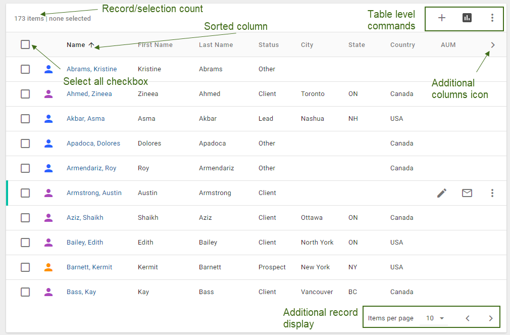
The record/selection count indicates the full number of the rows in the table and the number of selected rows, even when they are not visible on the screen.
The three-state Select all checkbox is displayed in the header row of the table. On click, select all the possible values, whether they are visible on the screen or not. If any values have been selected, on click, clear all checkboxes.
Display up to 2 command icons in the top right corner of the table. If more actions are available, include them in the overflow menu.
Data table row
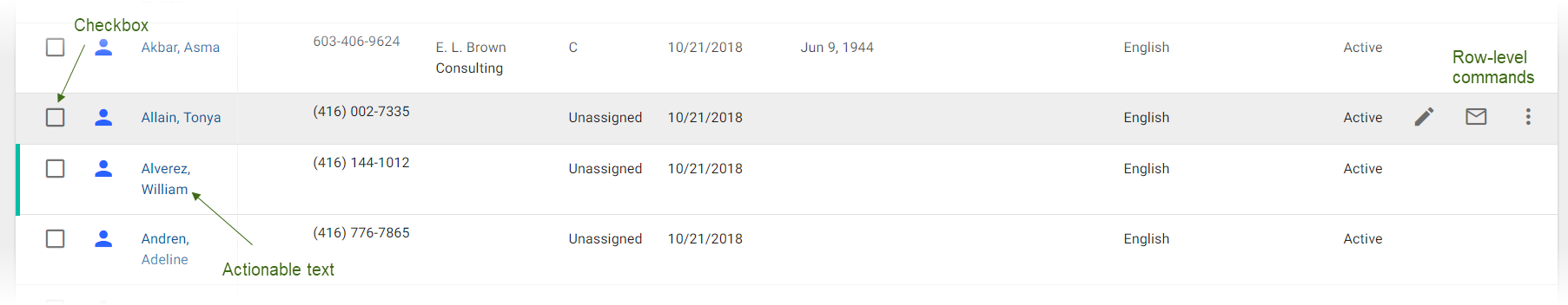
Use a checkbox to select records to be included in batch jobs.
Display up to 2 command icons in the right end of the row. If more actions are available, include them in the overflow menu. Row-level commands are displayed on hover.
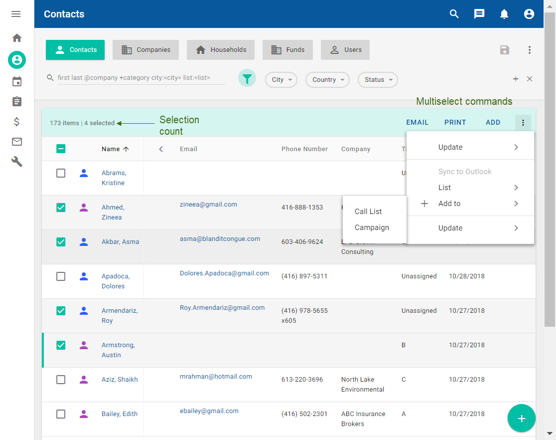
Data table with selected values
After at least one row has been selected, the selection count is updated to indicate the number of selected records. The table-level commands and row-level commands are no longer displayed. Instead, multiselect commands appear on the top right of the table. There are up to 3 commands and an overflow menu if more commands are available.
Interactions
Click a table-level command to open a dialog or a menu that either applies to the table itself (for example, select columns) or does not apply to any specific existing items (for example, add new contact).
Click a row-level command to open a dialog or a menu that applies only to that specific record.
Links (actionable text) are supported. Where text is black, no actions are available. Where text is blue, actions are possible depending on configuration and the context of the link. For an email address or a phone number, open the native application. For the name, open the details view for that contact.
Table navigation interactions
To sort any sortable column, click on the the column header, sort any sortable column. The column displays a down or up arrow. Unsorted sortable columns display an arrow when you hover over the column header.
The first two columns are always pinned. To view additional columns, click the left or right chevron which appears on the table header if more columns are available to be displayed.
To display more rows, click the left and right arrows on the bottom of the table. After clicking an arrow, the specified number of rows is displayed. The rows that were previously displayed are hidden, but any selections are retained. The arrows are disabled when no additional rows are available.