Semantic view paths
The strategy used for AFL UI testing is composed of using semantic view paths for detecting UI control zones and simulating UI events. A control in a user interface is an element of interaction, such as a button or a text input. Each control can contain various zones representing different areas of it. In general, a semantic view path contains three parts:
- A path for view tree navigation to the platform-specific visual control object
- A delimiter
- A semantic view zone path
For example, the workspaces/Contacts/refEntityNavigator/EntityList/groupLayout/tabPerson/grdEntity#cell.1.6 path can be used to navigate to a specific control view of the type ui.Table, and then to find a cell of that table with the row index of 1 and column index of 6.

Recorder
A recorder is implemented as a platform-specific plug-in to provide UI event simulation for triggering user actions. The following steps should be taken in order to use the recorder for automated UI testing of the AFL Portal:
- Launch the AFL application and log in to the AFL portal.
- Click on one of the control zones shown on the portal and use Ctrl+F12 to display the recorder. In deployed environments, you may need to append "?record=1" at the end of the URL for the recorder to be enabled.
- Start the recording script and simulate the user behavior.
- Access the developer tool and export script. The script must be shown in the console.
In order to play the recording back, the following steps should be taken:
- Access the web browser developer tool.
In the console, assign a variable to UI event simulation framework using the following statements:
JSvar sim = define.find("nexj/ui/sim"); var ev = define.load("nexj/ui/sim/ev/dom"); var ev = define.find("nexj/ui/sim/ev/dom");- Simulate user interactions with control zones using functions defined in the framework. For example, the following statement can be used to simulate the click event for a specific control zone with the semantic path of
query#clear:sim.use("query#clear").click();
Automated UI testing
This section documents various UI controls used in AFL Portal along with examples on how to use control-specific zones in UI tests.
CaptionInput
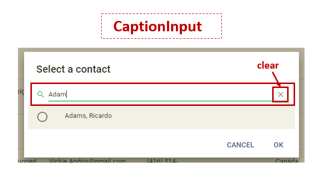
The CaptionInput control is visually represented by a text input that can be used by the user to either enter or clear the text. An Input control can be used as follows:
1 2 3 4 | * no argument: to select a text input.
- (sim'use "query")
* clear: the X button, which when clicked clears the text input.
- (sim'use "query#clear")
|
Combo
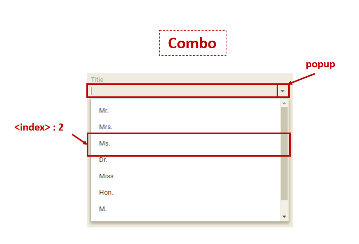
The Combo control is represented by a combination of a text input with a drop-down list. The text box value can be restricted to the options in the drop-down list, or unrestricted. A Combo can be used with the following arguments:
1 2 3 4 5 6 | * no argument: to select a combo text input.
- (sim'use "grpEntityLayout/1/grpDetailLayout/tabPerson/frmPersonEdit/cboTitle")
* popup: the arrow, which when clicked displays a drop-down list.
- (sim'use "grpEntityLayout/1/grpDetailLayout/tabPerson/frmPersonEdit/cboTitle#popup")
* index: to select an item from a menu drop-down list with a given index.
- (sim'use "grpEntityLayout/1/grpDetailLayout/tabPerson/frmPersonEdit/cboTitle/#2") |
Radio
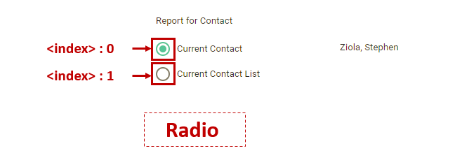
The Radio control allows the user to choose only one of a predefined set of mutually exclusive options. Radio can be used with the following arguments:
1 2 | * index: to check/uncheck the index radio button.
- (sim'use "tableLayout0/tableLayout1/frmContactDetailReportParameters/txtSelectionType#0")
|
Check
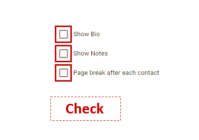
The Check control is represented by a checkbox button control, where the value of a checkbox depends on if it is checked or not. The isChecked function is used to check whether the value of a checkbox is true or false. For example, in the following figure the checkbox is checked, and thus the isChecked function returns true.
1 2 | * no argument: to check/uncheck a checkbox input.
- (sim'use "tableLayout0/tableLayout1/frmContactDetailReportParameters/chkShowBio")
|
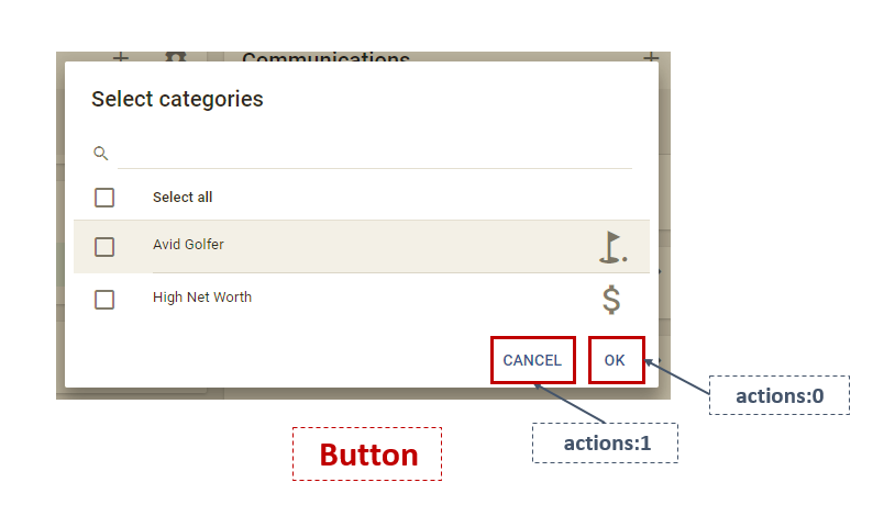
Button
The Button control is visually represented by a push button and can be used as follows:
1 2 3 | * no argument: to select a button.
- (sim'use "actions:0")
- (sim'use "actions:1")
|
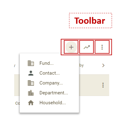
Toolbar
The Toolbar control is represented by a set of toolbar buttons, and it can be used with the following arguments:
1 2 | * no argument: to select a toolbar button.
- (sim'use "workspaces/Contacts/refEntityNavigator/EntityList/groupLayout/tabPerson/grdEntity/tools:0/0")
|
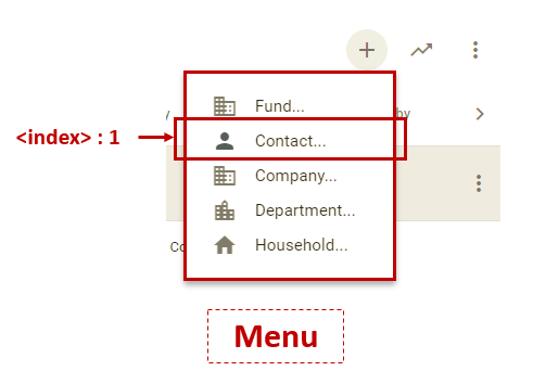
Menu
The Menu control is represented by a menu item list, and it can be used with the following arguments:
1 2 | * index: to select an item with a given index from a menu drop-down list.
- (sim'use "workspaces/Contacts/refEntityNavigator/EntityList/groupLayout/tabPerson/grdEntity/tools:0/menu:/0/grdEntity$entityTypesItem2$1#1") |
Tab
The Tab control is represented by a tab strip with each tab assigned to a layout, which can be used with the following arguments:
1 2 3 4 5 6 | * index: to select the index+1 tab item.
- (sim'use "workspaces/Contacts/p0/tabPersonJournal/refPersonJournalActivities/ref/gridActs/viewSelector#0")
* next: the right arrow, which when clicked navigates to the next tab items.
- (sim'use "workspaces/Contacts/p0/tabPersonJournal/refPersonJournalActivities/ref/gridActs/viewSelector#next")
* prev: the left arrow, which when clicked navigates to the previous tab items.
- (sim'use "workspaces/Contacts/p0/tabPersonJournal/refPersonJournalActivities/ref/gridActs/viewSelector#prev") |

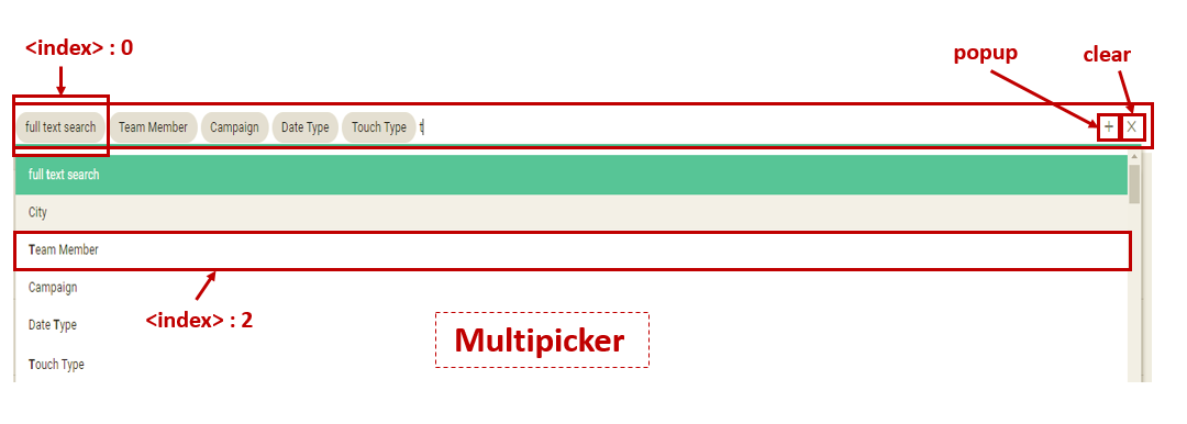
Picker/MultiPicker
The Picker/MultiPicker control provides a simple and intuitive interface to edit associations between class instances, and it is represented by a combination of a text input with a chipholder and a toolbar. A Picker/MultiPicker can be used with the following arguments:
1 2 3 4 5 6 7 8 9 10 11 12 13 14 | * no argument: to select a picker text input.
- (sim'use "workspaces/Contacts/refEntityNavigator/EntitySearch/fieldPicker")
* popup: the picker + button, which when clicked displays a drop-down list.
- (sim'use "workspaces/Contacts/refEntityNavigator/EntitySearch/fieldPicker#popup")
* clear: the picker x button, which when clicked clears the picker text input.
- (sim'use "workspaces/Contacts/refEntityNavigator/EntitySearch/fieldPicker#clear")
* index: to select the index+1 picked item.
- (sim'use "workspaces/Contacts/refEntityNavigator/EntitySearch/fieldPicker#0")
* del index: the x button of the index+1 picker item, which when clicked deletes that item.
- (sim'use "workspaces/Contacts/refEntityNavigator/EntitySearch/fieldPicker#del.0")
* index: to select the index+1 picker item.
- (sim'use "workspaces/Contacts/refEntityNavigator/EntitySearch/fieldPicker#0")
* index: to select a picker item from a menu drop-down list with a given index.
- (sim'use "workspaces/Contacts/refEntityNavigator/EntitySearch/fieldPicker/#2")
|

Tile
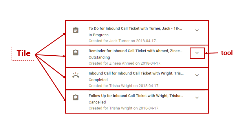
The Tile control is used to represent a single, implicitly structured data item in a List, and it can be used with the following arguments:
1 2 3 4 | * no argument: to select a tile.
- (sim'use "workspaces/Home/p0/tabHome/refTask/refTask/frmTaskUserList/gridActs/1/view:")
* tool: the tile tool button, which when clicked performs an action.
- (sim'use "workspaces/Home/p0/tabHome/refTask/refTask/frmTaskUserList/gridActs/1/view:#tool") |
List
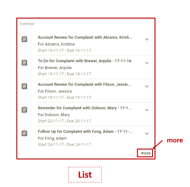
The List control is used to represent a list of tiles, and it can be used with the following arguments:
1 2 | * more: the more button, which when clicked displays more tiles of the list.
- (sim'use "workspaces/Home/p0/tabHome/refTask/refTask/frmTaskUserList/gridActs#more")
|
Table
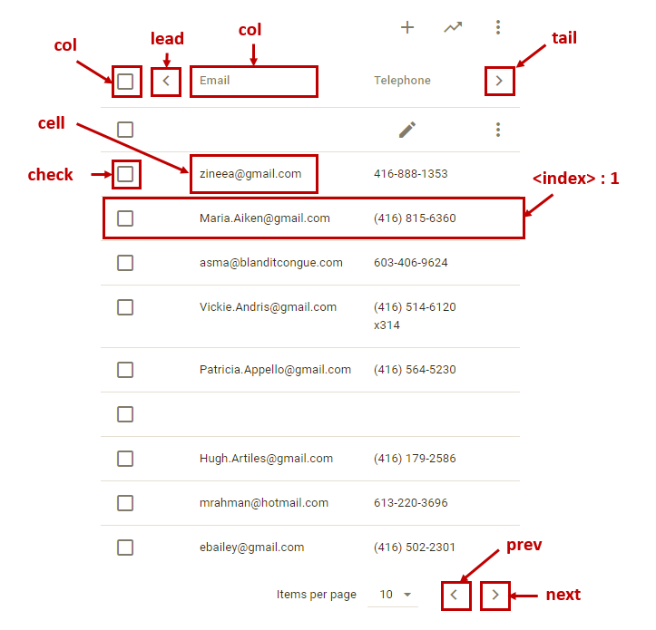
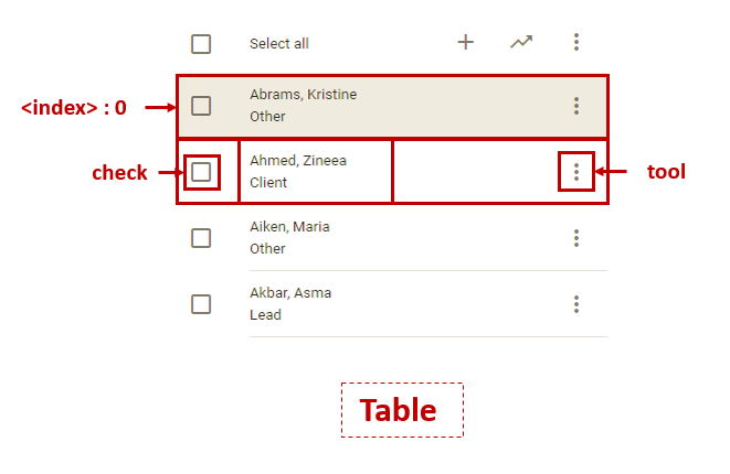
The Table control positions its children controls in a grid. The grid layout consists of collections of rows and columns. Each row has a collection of control zones. The toolbar on top of it allows the users to perform various operations on items list. Table can be used with the following arguments:
1 2 3 4 5 6 7 8 9 10 11 12 13 14 15 16 | * cell row and column index: to select a table cell with given row and column indexes.
- (sim'use "workspaces/Contacts/refEntityNavigator/EntityList/groupLayout/tabPerson/grdEntity#cell.2.2")
* col index: to select a header with a given column index.
- (sim'use "workspaces/Contacts/refEntityNavigator/EntityList/groupLayout/tabPerson/grdEntity#col.0")
* check index: to mark/unmark a check box at a given row index.
- (sim'use "workspaces/Contacts/refEntityNavigator/EntityList/groupLayout/tabPerson/grdEntity#check.1")
* tool: the tools icon, which when clicked displays a menu.
- (sim'use "workspaces/Contacts/refEntityNavigator/EntityList/groupLayout/tabPerson/grdEntity#tool.2")
* tail: the header right arrow, which when clicked navigates to the following columns.
- (sim'use "workspaces/Contacts/refEntityNavigator/EntityList/groupLayout/tabPerson/grdEntity#tail")
* lead: the header left arrow, which when clicked navigates to the previous columns.
- (sim'use "workspaces/Contacts/refEntityNavigator/EntityList/groupLayout/tabPerson/grdEntity#lead")
* prev: the footer left arrow, which when clicked navigates to the previous rows.
- (sim'use "workspaces/Contacts/refEntityNavigator/EntityList/groupLayout/tabPerson/grdEntity#prev")
* next: the footer right arrow, which when clicked navigates to the following rows.
- (sim'use "workspaces/Contacts/refEntityNavigator/EntityList/groupLayout/tabPerson/grdEntity#next")
|
Page
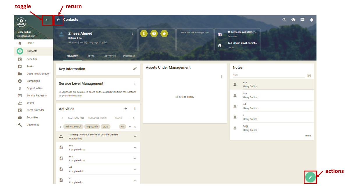
The Page control represents a top-level page template that holds different types of controls. The user can return to the previous page using the return button or perform various actions using the actions button. Page can be used with the following arguments:
1 2 3 4 5 6 7 8 9 10 | * actions: to select actions button.
- (sim'use "#actions")
* return: to select return button.
- (sim'use "#return")
* toggle: to select toggle button in navigation drawer.
- (sim'use "#toggle")
* open: to select open button.
- (sim'use "#open")
* close: to select close-drawer button.
- (sim'use "#close")
|
Calendar
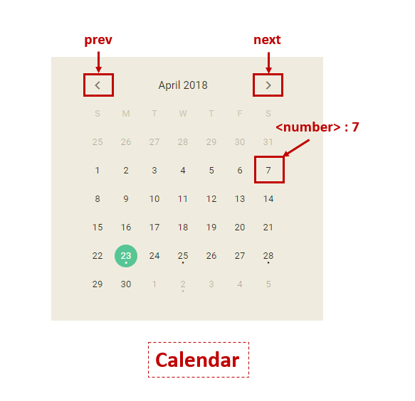
The Calendar control is represented by a calendar element and allows the user to select a specific day, month, and year from a table-like calendar. The user can also move to the next or previous month or year using the chevron navigation buttons 

1 2 3 4 5 6 | * number of the day: to choose a specific day from calendar with a given day number.
- (sim'use "workspaces/Schedule/refSchedule/spltMyRight/frmSchedule/schedule/cal#7")
* next: the right arrow, which when clicked navigates to the next rows.
- (sim'use "workspaces/Schedule/refSchedule/spltMyRight/frmSchedule/schedule/cal#next")
* prev: the left arrow, which when clicked navigates to the previous rows.
- (sim'use "workspaces/Schedule/refSchedule/spltMyRight/frmSchedule/schedule/cal#prev")
|
ScheduleDate
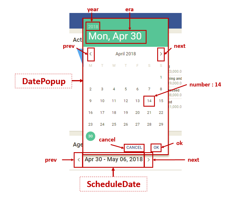
The ScheduleDate control is used to display the date in a schedule view, and it can be used with the following arguments:
1 2 3 4 5 6 | * popup: the date label, which when clicked opens up a date popup.
- (sim'use "workspaces/Home/p0/tabHome/refAgenda/refAgenda/frmScheduleItemGrid/grdScheduleItem/ctrlDate#popup")
* next: the right arrow, which when clicked navigates to the next day.
- (sim'use "workspaces/Home/p0/tabHome/refAgenda/refAgenda/frmScheduleItemGrid/grdScheduleItem/ctrlDate#next")
* prev: the left arrow, which when clicked navigates to the previous day.
- (sim'use "workspaces/Home/p0/tabHome/refAgenda/refAgenda/frmScheduleItemGrid/grdScheduleItem/ctrlDate#prev")
|
Date
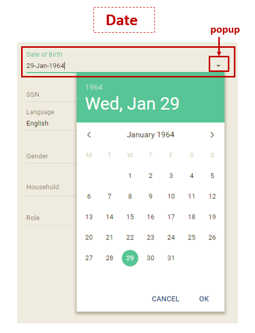
The Date control is represented by a combination of a text input with a drop-down list, and it can be used with the following arguments:
1 2 3 4 | * no argument: to select a date text input.
- (sim'use "grpEntityLayout/1/grpDetailLayout/tabPerson/frmPersonEdit/inpDOB")
* popup: the arrow, which when clicked displays a drop down calendar.
- (sim'use "grpEntityLayout/1/grpDetailLayout/tabPerson/frmPersonEdit/inpDOB#popup")
|
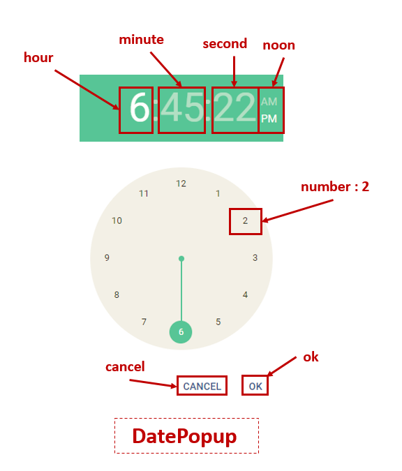
DatePopup
The DatePopup control is represented by a popup window that contains either a calendar or a clock element. The user can first click on a date label to select a specific year, month, or day from a calendar or a time label to select a specific hour, minute, or second from the clock. The user can also move to the next or previous month using the chevron navigation buttons 

1 2 3 4 5 6 7 8 9 10 11 12 13 14 15 16 17 18 19 20 21 22 | * year: the year caption, which when clicked displays a menu to choose a specific year from calendar.
- (sim'use "workspaces/Home/p0/tabHome/refAgenda/refAgenda/frmScheduleItemGrid/grdScheduleItem/ctrlDate/#year")
* day/era: the date caption, which when clicked displays a calendar to select a day or a month.
- (sim'use "workspaces/Home/p0/tabHome/refAgenda/refAgenda/frmScheduleItemGrid/grdScheduleItem/ctrlDate/#era")
* hour: the hour caption, which when clicked displays a clock.
- (sim'use "workspaces/Home/p0/tabHome/refAgenda/refAgenda/frmScheduleItemGrid/grdScheduleItem/ctrlDate/#hour")
* minute: the minute label, which when clicked displays a clock.
- (sim'use "workspaces/Home/p0/tabHome/refAgenda/refAgenda/frmScheduleItemGrid/grdScheduleItem/ctrlDate/#minute")
* second: the second label, which when clicked displays a clock.
- (sim'use "workspaces/Home/p0/tabHome/refAgenda/refAgenda/frmScheduleItemGrid/grdScheduleItem/ctrlDate/#second")
* noon index: to choose "AM" index : 0 or "PM" index : 1 from a datePopup.
- (sim'use "workspaces/Home/p0/tabHome/refAgenda/refAgenda/frmScheduleItemGrid/grdScheduleItem/ctrlDate/#noon.1")
* number of year/day/hour/minute/second> : to choose a specific year/day/hour/minute/second from a calendar/clock with a given number.
- (sim'use "workspaces/Home/p0/tabHome/refAgenda/refAgenda/frmScheduleItemGrid/grdScheduleItem/ctrlDate/#14")
* next: the right arrow, which when clicked navigates to the next month.
- (sim'use "workspaces/Home/p0/tabHome/refAgenda/refAgenda/frmScheduleItemGrid/grdScheduleItem/ctrlDate/#next")
* prev: the left arrow, which when clicked navigates to the previous month.
- (sim'use "workspaces/Home/p0/tabHome/refAgenda/refAgenda/frmScheduleItemGrid/grdScheduleItem/ctrlDate/#prev")
* cancel: the cancel botton.
- (sim'use "workspaces/Home/p0/tabHome/refAgenda/refAgenda/frmScheduleItemGrid/grdScheduleItem/ctrlDate/#cancel")
* ok: the ok button.
- (sim'use "workspaces/Home/p0/tabHome/refAgenda/refAgenda/frmScheduleItemGrid/grdScheduleItem/ctrlDate/#ok")
|

Schedule
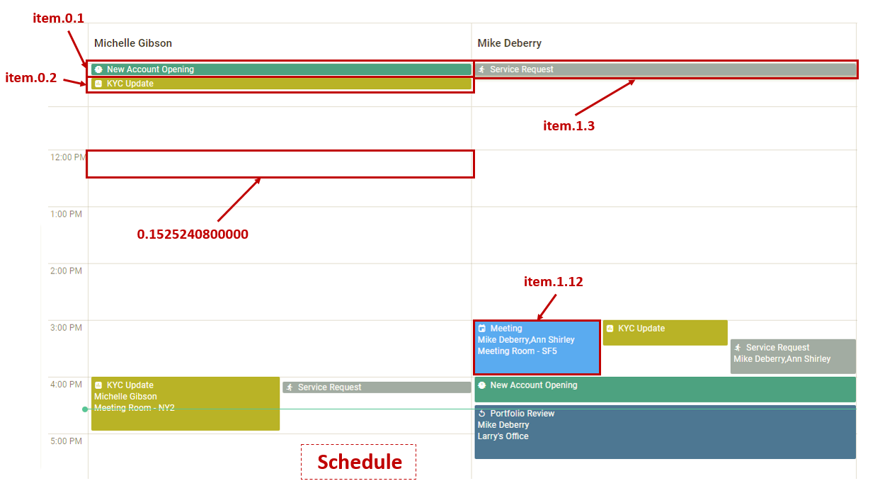
The Schedule control is used to display a schedule item in a daily, a weekly, or a monthly schedule view, and it can be used with the following arguments:
1 2 3 4 | * item user and schedule item index: to select a particular schedule item with a given index in the schedule view of a user with a given index.
- (sim'use "workspaces/Schedule/refSchedule/spltMyRight/frmSchedule/schedule/2#item.0.1")
* timestamp: to select a particular time period with a given timestamp in the schedule view of a user with a given index.
- (sim'use "workspaces/Schedule/refSchedule/spltMyRight/frmSchedule/schedule/2#0.1525240800000")
|
Tree
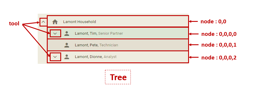
The Tree control represents the tree-like structure in which the data elements are organized, where each element is represented by a node and its position in the tree structure is represented by the column and row indexes. To represent the elements in a hierarchical structure, each child node has an additional row and column indexes compared to its parent. For example, in the following figure the root is represented by a node with 0,0 indexes, and its children are represented by nodes with 0,0,0,0, 0,0,0,1, and 0,0,0,2 indexes, respectively. In addition, the up-pointing and down-pointing arrows are used to open and close the node’s descendants.
1 2 3 4 | * variable number of indexes: to select a tree node with given indexes.
- (sim'use "workspaces/Contacts/p0/tabPersonDetail/refPersonHierarchy/refPersonHierarchy/groupPolyHierarchy/1/tabCompanyHierarchy/EntityHierarchyCo/treeHierarchy#0,0")
* variable number of indexes tool: the tool icon, which when clicked opens or closes a tree node descendants.
- (sim'use "workspaces/Contacts/p0/tabPersonDetail/refPersonHierarchy/refPersonHierarchy/groupPolyHierarchy/1/tabCompanyHierarchy/EntityHierarchyCo/treeHierarchy#0,0,0,0.tool")
|
Note
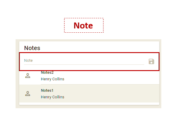
The Note control is represented by a combination of a text input with a toolbar. A Note can be used with the following arguments:
1 2 3 4 | * no argument: to select a note text input.
- (sim'use "workspaces/Contacts/p0/tabSummary/refPersonNotes/refPersonNotes/ref/ctrlNote/")
* no argument: the Save button, which when clicked saves the text input and adds it to the notes list.
- (sim'use "workspaces/Contacts/p0/tabSummary/refPersonNotes/refPersonNotes/ref/ctrlNote/toolbar:/0")
|
Label
A Label is a UI control which displays a non-editable text. It is usually a static control; having no interactivity.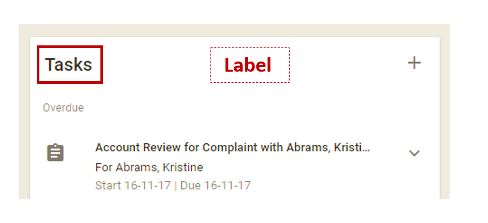
Dialog
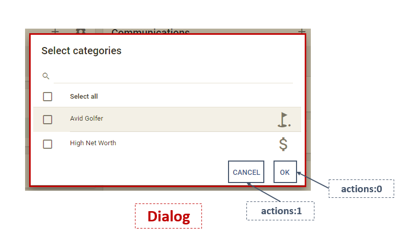
A Dialog control is a window that communicates information to the user, containing text and other UI controls. It also may require an acknowledgment that the information has been read, usually by clicking the OK button, or a decision as to whether or not an action should proceed, by clicking the OK or Cancel buttons. A Dialog can be used with the following arguments:
1 2 3 4 5 6 7 | * no argument: to select a dialog text input.
- (sim'use "query")
* no argument: to click on the "OK" or "Cancel" buttons.
- (sim'use "actions:1")
- (sim'use "actions:0")
* no argument: to select a tile on the dialog.
- (sim'use "3/0")
|
Form
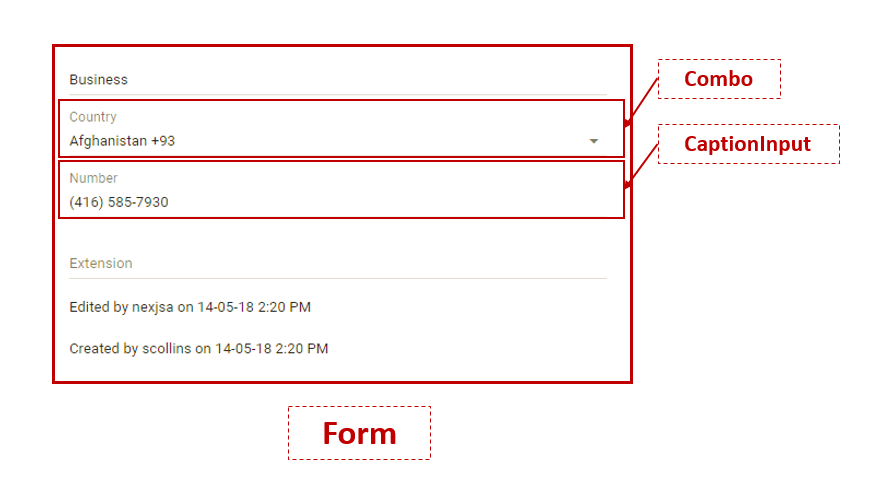
A Form control represents a set of related user input controls in a structured way. It can be used as follows:
1 2 | * no argument: to select a form.
- (sim'use "tblBorderLayout/tblFormView/grpTelcomLayout/tabTelephone/frmTelephone")
|
Card
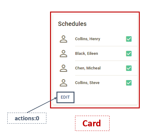
A Card control is a rectangle shaped composite that may contain a set of related controls to represent the contain content and actions about a single topic. It can be used as follows:
1 2 | * no argument: to select a Card.
- (sim'use "workspaces/Schedule/refSchedule/spltMyRight/frmSchedule/schedule/1")
|
Chart
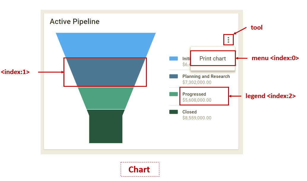
A Chart control is used to display the data by various types of charts such as Bar, Column, Pie, Line, and so on. A Chart control may contain a chart representation of the data, a toolbar, and chart legends, and it can be used as follows:
1 2 3 4 5 6 7 8 | * tool: the tool icon, which when clicked opens up a menu drop-down list.
- (sim'use "workspaces/Home/p0/tabHome/refChartPipelineFunnelChart/refChartPipelineFunnelChart/frmChart/funnelChart#tool")
* menu index: to select an item from a chart menu drop-down list with a given index.
- (sim'use "workspaces/Home/p0/tabHome/refChartPipelineFunnelChart/refChartPipelineFunnelChart/frmChart/funnelChart#menu.2")
* index: to select a data point in a chart.
- (sim'use "workspaces/Home/p0/tabHome/refChartPipelineFunnelChart/refChartPipelineFunnelChart/frmChart/funnelChart#1")
* legend & index: to select a chart legend with a given index.
- (sim'use "workspaces/Home/p0/tabHome/refChartPipelineFunnelChart/refChartPipelineFunnelChart/frmChart/funnelChart#legend.2")
|
Range
The Range is the UI control of choice for letting users select a value or range from a fixed set of options using a slider. The slider is an input control that is used to slide between the smallest and largest values. The setRange function is used to to set the value of this control in terms of percentage. 
Banner
A Banner is represented by a frame that runs across the top of a page.
1 2 | * caption: to select a caption. |
