React rendered controls basics
Learning objectives
- To gain basic experience building portlets with React.
Key concepts
- React table - a lightweight, fast and extendable datagrid built for React.
Project structure - a NexJ project may contain a few different types of code:
- MDA components in the
metafolder. - Java components in the
liborsrcfolder. - JavaScript components in the
modfolder.
These modules are combined (mixed in) to create your application.
- MDA components in the
The following excerpt from the AFL Developer Guide is concise and packed with information. In this lesson, we explore the meaning of this excerpt, and provide some examples of how to apply these capabilities and build the UI with React.
From the AFL Developer Guide
To use React for view rendering, one can derive the renderer from nexj/ui/react/dom.ReactRenderer and override the _component template method to return the React component instance. The React modules must be specified as dependencies of the renderer. These must have already been compiled to ECMAScript, per reactjs.org . For development with JSX, you should start a babel-cli listener on the source code directory, so that JSX files can be converted to ECMAScript files automatically. For more information, see reactjs.org. The renderer deriving from ReactRenderer should be written in ECMAScript, as JSX provides no benefit at this point and the required API is trivial. *.css.def files can be used for including the React module CSS files without renaming them.
In preparation for the learning activities in this lesson:
Open your training instance of NexJ Studio.
Prerequsite
If you haven't installed the training version of NexJ Studio or your environment isn't set up yet, follow the instructions in the Setting up for training section.
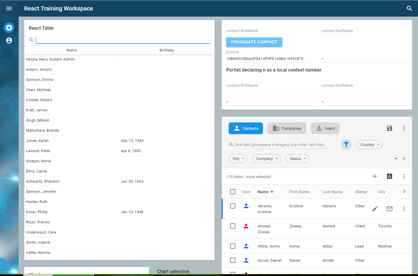
- Start your server, and open http://localhost:7080/training/ui/portal/training:React in a new tab. Your UI should look similar to the following:
The React training workspace contains four portlets:
- The portlet in the upper left is rendered by React.
- The portlet in the upper right is an AFL portlet that gives us a view into the context bus, which is how portlets communicate with each other. Specifically, this portlet shows the current value for the
EntityIdandOtherIdcontext variables used in this lesson. - The list at the bottom right is an MDA EntityNavigator portlet.
- The chart portlet at the bottom left is another demo AFL portlet.
Let's start by looking at the React Table example at a high level, to see how React portlets are structured. We will then work with a Hello World React component, and progress from there.
Remote vs AFL Portlets
With this development pattern, (AFL with React rendering), you still need a bit of AFL to provide a bridge to the portal. This allows React to render right inside the applications DOM and participate in all of the context and application lifecycle events. There are alternatives. The portal supports MDA, AFL, and remote portlets. You can also use remote portlets to integrate with services written in React (or any other web technology), with context and events being communicated over the portal API. This comes with some iFrame downsides and is discussed in another lesson.
You have several options as to how to structure your code, including:
- Develop mainly in React and only use AFL as the bridge to other portlets. With this approach, you build a React component that exposes properties and events, and the AFL code is configured once to set the expected properties and respond to the provided events. You can then use your choice of processes and techniques to build the look and feel, internal state, and even data access of your component. This is effectively what the react-table example does.
Use the React renderer as a simple replacement for the AFL renderer, which uses the JSONML standard instead of React's
createElementorcreateComponent. This approach is useful if you want to mix some of the other AFL libraries directly in your rendering code, for example, internationalization, time zone management, converters, context bus, and so on. The Hello World example demonstrates how this works.React createElement vs JSONML
There are many similarities between React rendering and AFL's use of JSONML. Here is a simple comparison of how the same information is rendered:
return React.createElement("div", {className: "hello"}, "Hello ", this.name(), React.createElement("ul", null, React.createElement("li", null, "one"), React.createElement("li", null, "two"), React.createElement("li", null, "three")));In JSONML, it would be:
["DIV",{"className":"hello"},"Hello ", this.name(),["UL",null,["LI",null,"one"],["LI",null,"two"],["LI",null,"three"]]]
React table (react-table)
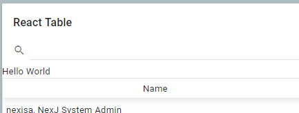
Let's look at a working example. The react-table example incorporates react-table, a lightweight, fast and extendable datagrid built for React. Go to http://localhost:7080/training/ui/portal/training:React and look at the React table portlet to see the results of binding to the Person Class. The React table portlet supports sorting, simple filtering, and shows mixing AFL and React components both ways. In this example, the AFL Card hosts a react-table control, and the react-table control hosts some AFL column controls.
Let's take a quick look at how this was done. Don't worry too much about the detailed code at this point. The goal here is to get an overall sense of the structure and how components relate to each other. After this section, we will get a hands-on introduction to code starting with hello world and moving on from there.
Project structure
In NexJ Studio, in the Navigator view of the Java perspective, inspect the structure of the projects (modules). A MODL project may contain a few different types of code:
- MDA components in the meta folder.
- Java components in the lib or src folder.
- JavaScript components in the mod folder.
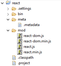
These modules are combined (mixed in) to create your application. They are configured to build all the code and make it available in the bin folder. You can look in the.project and .classpath files to see the configuration. The end result is that JavaScript files from all of your modules get copied together with their relative path from the mod folder's root. This means, if you choose to, you can keep all of your React assets in a separate module for a given control. The first module in our example includes react and react-dom, which are the core ReactJS libraries.
The framework loads minified libraries whenever possible. If in debug, it uses the non-minified source.
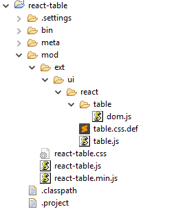
We then have our React-table control definition in the React table module.
This module contains the react-table assets (react-table.js, react-table.min.js, and react-table.css) from the react-table distribution in the root of the mod folder. It also contains our control definition, which is made up of three files.
The view (ext/ui/react/table.js)
This is an AFL module, so it defines its name and dependencies and returns a function that returns our control definition. This definition gives it a name, says what it is derived from, and adds additional properties and methods to the control.
	table.Table = sys.derive(ui.View, [ui.ModelHelper], {
		/** @prop {ui.Column[]} Table columns */
		columns: sys.accessor(ui.views),
		/** @prop {ui.Collection} Collection of items for each row */
		rows: sys.accessor(ui.collection),
		/** @prop {ui.Value} Currently selected row index */
		index: sys.accessor(ui.value),
		/** @see ui.View#initialize */
		...
The renderer (ext/ui/react/table/dom.js)
This is an AFL module. It defines its name and dependencies and extends the table.Table with rendering logic. In the ReactRenderer._component function, we can combine React code with properties from the view to render the control's current state appropriately.
	tren("Table", sys.derive(ren.ReactRenderer, {
		/** @see ren.ReactRenderer#_component */
		_component: function() {
			var rows = this.rows(), data = new Array((rows) ? rows.length() : 0);
			if (rows) rows.loop(function(item, index) {data[index] = index;});
			return react.createElement(rtable["default"],
				{showPagination: false, data: data, columns: sys.map(this.columns() || [],

			...
The styling (ext/ui/react/table.css)
Usually the control's styling, but in this case, we want to include the css from the React-table control, so we use the .def approach to point to react-table.css. Def files are a simple way to include CSS and JS files from a different local or remote location.
.def files
The application and portlet (training)
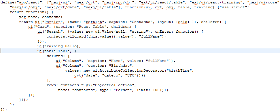
The final piece here is using the control. The portlet is defined in training/mod/app/react.js and is referenced in the React Training workspace file as the top right portlet.
You can see in the blue highlighted line below where the Portlet includes a reference to the React table and sets its properties. Don't be too concerned about the code here. The key point is that we can build a portlet that contains appropriately set table.Table controls (in this case bound to the Person class), and have it rendered by React.
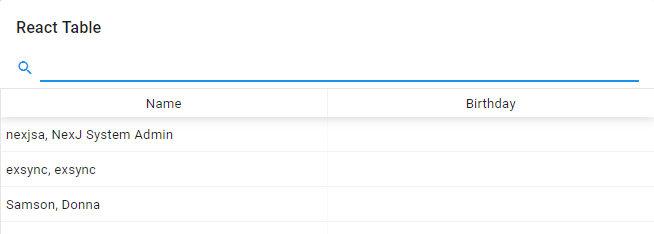
Which results in the following:
Note
Putting the React-table control code in its own module was a choice. We could have placed these resources directly in our project's mod folder. We could have opted to combine some of these files together (such as the control definition and the rendering code) into one file. We could have chosen to place the react-table.* resources in one module, and the AFL bridge assets in another. In our example, the react-table.* resources are in the same file as the AFL ones and have kept the AFL control definition separate from it's dom renderer.
This is the current best practice.
Hello World
Let's step back and start with the basics. Look in the react-training project using the Java perspective. We are going to be working in the react-training project.
In training.js, we define our control view - training.Hello - and in dom.js (or JSX), our renderer is defined as return React.createElement('div'). The Hello control is already included in our react portlet (seen in the code above) as ui(training.Hello). We could work right in the compiled React code in the dom.js file, but it is more convenient to code in dom.jsx and let the babel-cli compile for us.
Setting up for babel
Prerequisites
You must have npm or yarn installed. If you do not:
- Download
node.js, which comes with npm included, from https://nodejs.org/en/download/. Before installing babel, go to your command prompt and enter:
c:
cd c:\nexj_studio\13.0-training\training\models\react-training
npm init
This creates a
package.jsonin your project.
Learning activity
At your command prompt, enter the following:
c:
cd c:\nexj_studio\13.0-training\training\models\react-training
npm install --save-dev @babel/core @babel/cli @babel/preset-react
At your command prompt, enter the following:
c:
cd c:\nexj_studio\13.0-training\training\models\react-training\mod\ext\ui\react\training
npx babel --presets @babel/preset-react dom.jsx --watch --out-file dom.js
- Switch to NexJ Studio (Java Perspective) or your favorite editor and open
react-training\mod\ext\ui\react\training\dom.jsx.
You can open the JSX and JS files side-by-side and notice the changes that happen in the JS file as you update the JS file.
Making changes
Learning activity
In your JSX file, replace
return <div/>; with the following:react-training/mod/ext/ui/react/training/dom.jsxreturn <div>Hello World</div>;
- Save your file. You should see your
dom.jsfile update. - Ensure that your server is running and browse to http://localhost:7080/training/ui/portal/training:React. Your UI should look similar to this:
In a text editor, add the following to
react-training/mod/ext/ui/react/training.cssand save your file.react-training/mod/ext/ui/react/training.css.hello { color: blue; padding: 10px; font-size: 30px; }Change the return value in your
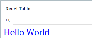
dom.jsxfile to the following:react-training/mod/ext/ui/react/training/dom.jsxreturn <div className='hello'>Hello World</div>;
- Save and refresh your browser. Your UI should look similar to the following:
Setting a property
Learning activity
Open
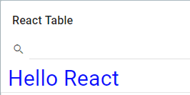
training/mod/app/react.jsand set the name property of yourtraining.Hellocontrol toui(training.Hello, {name: "React"}).training/mod/app/react.jsui(training.Hello, {name: "React"})In your JSX file, change the returned value to
return<div className='hello'>Hello {this.name()}</div>;react-training/mod/ext/ui/react/training/dom.jsxreturn <div className='hello'>Hello {this.name()}</div>;- Save the file and refresh your browser. This illustrates how you can mix the dom rendering code with values from the control's model.
Receiving context
Let's add a new attribute to the Hello view and bind it to the context bus.
Learning activity
Update your
training.jsview as follows:react-training/mod/ext/ui/react/training.jsdefine("ext/ui/react/training", ["nexj/sys", "nexj/ui", "exports", "nexj/ui/core"], function(sys, ui, training) {"use strict"; training.Hello = sys.derive(ui.View, [ui.ModelHelper], { text: sys.accessor(ui.value), _mustRender: function() { return this._valueAltered("text"); } }); } );You've added a text property to the control in line 4 and are providing code to the
_mustRenderproperty (a standard view property) to re-render whenever the text property's value requires refreshing (line 5 and 6).Update
dom.jsxto return the value of your text property.react-training/mod/ext/ui/react/training/dom.jsxreturn <div className='hello'>Hello {this.name()} {this.text().value()}</div>;- Update your
react.jsportlet to receive and set context by:- Adding the
nexj/ui/busmixin (see line 2 below). Binding the text property of our
training.Hellocontrol to theEntityIdcontext. This is what we do in the lineui(training.Hello, {name: "React", text: new ui.ContextValue("EntityId")}),training/mod/app/react.jsdefine("app/react", ["nexj/ui", "nexj/cvt", "nexj/rpc/obj", "ext/ui/react/table", "ext/ui/react/training", "nexj/ui/core", "nexj/ui/obj", "nexj/cvt/date", "nexj/ui/table", "nexj/ui/bus"], function(ui, cvt, obj, table, training) {"use strict"; return function() { var name, contacts; return ui("Portlet", {name: "portlet", caption: "Contacts", layout: {cols: 1}, children: [ ui("Card", {caption: "React Table", children: [ ui("Search", {value: new ui.Value(null, "string"), onEnter: function() { contacts.wildcard(this.value().value(), "fullName"); }}), ui(training.Hello, {name: "React", text: new ui.ContextValue("EntityId")}), ui(table.Table, { columns: [ ui("Column", {caption: "Name", values: "fullName"}), ui("Column", {caption: "Birthday", values: new ui.AttributeCollectionDecorator("birthTime", cvt("date", "date.m", "UTC"))}) ], rows: contacts = ui("ObjectCollection", {name: "contacts", type: "Person", limit: 100})}) ]}) ]}); }; });When
"nexj/ui/bus"was added as an import, it was not necessary to add a variable like"bus"to the function imports, that is,function(ui, cvt, obj, table, training)because"nexj/ui/bus"is a plug-in module for"nexj/ui"and adds all of its capabilities to the"ui"variable. For more information, see the AFL Developer Guide in the Modular Programming section.
- Adding the
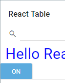
- Save and refresh your browser. Your UI should look similar to the following:
When you click around in the Entity Navigator in the bottom right hand corner of your workspace, the value of theEntityIdshould update.
Sending an event over the bus
In this example, we will add a Toggle control that sends it's state out over the bus.
Learning activity
In
training.js, create a new control calledToggleby adding the following code (line 9).react-training/mod/ext/ui/react/training.jsdefine("ext/ui/react/training", ["nexj/sys", "nexj/ui", "exports", "nexj/ui/core"], function(sys, ui, training) {"use strict"; training.Hello = sys.derive(ui.View, [ui.ModelHelper], { text: sys.accessor(ui.value), _mustRender: function() { return this._valueAltered("text"); } }); training.Toggle = sys.derive(ui.View, [ui.ModelHelper]); } );Add the component definition to your
dom.jsxfile by copying and overwriting your code. To learn more about the details of the React component, see the Handling Events discussion at https://reactjs.org.react-training/mod/ext/ui/react/training/dom.jsxdefine("ext/ui/react/training/dom", ["nexj/sys", "nexj/ui/react/dom", "ext/ui/react/training", "react"], function(sys, ren, training, React) {"use strict"; var tren = ren.declarator(training); tren("Hello", sys.derive(ren.ReactRenderer, { /** @see ren.ReactRenderer#_component */ _component: function() { // return react code here return <div className='hello'>Hello {this.name()} {this.text().value()}</div>; } })); class Toggle extends React.Component { constructor(props) { super(props); this.state = {isToggleOn: true}; // This binding is necessary to make `this` work in the callback this.handleClick = this.handleClick.bind(this); } handleClick() { this.setState(prevState => ({ isToggleOn: !prevState.isToggleOn })); } render() { return ( <button className="-button-push" onClick={this.handleClick}> {this.state.isToggleOn ? 'ON' : 'OFF'} </button> ); } } tren("Toggle", sys.derive(ren.ReactRenderer, { /** @see ren.ReactRenderer#_component */ _component: function() { // return react code here return <Toggle/>; } })); });Add a Toggle control by modifying your
react.jsapp as follows:training/mod/app/react.js... ui(training.Hello, {name: "React", text: new ui.ContextValue("EntityId")}), ui(training.Toggle), ...Save your changes and refresh your UI. You should see a button that toggles on and off and retains its state.
To enhance your Toggle so that it can tell you if the state has changed and you can broadcast it over the context bus, you must first enhance your
training.jsview definition as follows to allow anonChangeevent:react-training/mod/ext/ui/react/training.js... training.Toggle = sys.derive(ui.View, [ui.ModelHelper], { /** @prop {function()} Click handler */ onChange: sys.accessor }); ...Enhance your Toggle component definition to call the
onChangeevent when the state changes. The modifications todom.jsxare on line 14 and line 31.react-training/mod/ext/ui/react/training/dom.jsxclass Toggle extends React.Component { constructor(props) { super(props); this.state = {isToggleOn: true}; // This binding is necessary to make `this` work in the callback this.handleClick = this.handleClick.bind(this); } handleClick() { this.setState(prevState => ({ isToggleOn: !prevState.isToggleOn })); this.props.onChange(this.state.isToggleOn ? 'ON' : 'OFF'); } render() { return ( <button className="-button-push" onClick={this.handleClick}> {this.state.isToggleOn ? 'ON' : 'OFF'} </button> ); } } tren("Toggle", sys.derive(ren.ReactRenderer, { /** @see ren.ReactRenderer#_component */ _component: function() { // return react code here return <Toggle onChange={this.onChange()}/>; } }));In
react.js, update yourtraining.Toggledefinition as follows:training/mod/app/react.jsui(training.Toggle, {onChange: function(val) {ui.context("OtherId").value(val);}}),- Save your changes. When you toggle the state in the React Table portlet with the toggle button, the Other Id context will be changed. The Other Id field is highlighted in the screenshot below. You can see this in the context portlet at the upper right of your application.
Hello World clock (state and lifecycle)
The following is another example illustrating creating components and state. If you want to follow the React tutorial, you can see details at https://reactjs.org/docs/state-and-lifecycle.html.
Learning activity
Create a new control by adding a new one to your
training.jsfile (seen here on line 13).react-training/mod/ext/ui/react/training.jsdefine("ext/ui/react/training", ["nexj/sys", "nexj/ui", "exports", "nexj/ui/core"], function(sys, ui, training) {"use strict"; training.Hello = sys.derive(ui.View, [ui.ModelHelper], { text: sys.accessor(ui.value), _mustRender: function() { return this._valueAltered("text"); } }); training.Toggle = sys.derive(ui.View, [ui.ModelHelper], { /** @prop {function()} Click handler */ onChange: sys.accessor }); training.Clock = sys.derive(ui.View, [ui.ModelHelper]); } );Add the component definition to your
dom.jsxfile (line 47 and on).react-training/mod/ext/ui/react/training/dom.jsxdefine("ext/ui/react/training/dom", ["nexj/sys", "nexj/ui/react/dom", "ext/ui/react/training", "react"], function(sys, ren, training, React) {"use strict"; var tren = ren.declarator(training); tren("Hello", sys.derive(ren.ReactRenderer, { /** @see ren.ReactRenderer#_component */ _component: function() { // return react code here return <div className='hello'>Hello {this.name()} {this.text().value()}</div>; } })); class Toggle extends React.Component { constructor(props) { super(props); this.state = {isToggleOn: true}; // This binding is necessary to make `this` work in the callback this.handleClick = this.handleClick.bind(this); } handleClick() { this.setState(prevState => ({ isToggleOn: !prevState.isToggleOn })); this.props.onChange(this.state.isToggleOn ? 'ON' : 'OFF'); } render() { return ( <button className="-button-push" onClick={this.handleClick}> {this.state.isToggleOn ? 'ON' : 'OFF'} </button> ); } } tren("Toggle", sys.derive(ren.ReactRenderer, { /** @see ren.ReactRenderer#_component */ _component: function() { // return react code here return <Toggle onChange={this.onChange()}/>; } })); function App() { return ( <div> <Clock /> <Clock /> <Clock /> </div> ); } function FormattedDate(props) { return <h2>It is {props.date.toLocaleTimeString()}.</h2>; } class Clock extends React.Component { constructor(props) { super(props); this.state = {date: new Date()}; } componentDidMount() { this.timerID = setInterval( () => this.tick(), 1000 ); } componentWillUnmount() { clearInterval(this.timerID); } tick() { this.setState({ date: new Date() }); } render() { return ( <div> <h1>Hello, world!</h1> <FormattedDate date={this.state.date} /> </div> ); } } tren("Clock", sys.derive(ren.ReactRenderer, { /** @see ren.ReactRenderer#_component */ _component: function() { // return react code here return <Clock/>; } })); });Add a Clock control to the
react.jsapp.training/mod/app/react.js... ui(training.Hello, {name: "React", text: new ui.ContextValue("EntityId")}), ui(training.Toggle, {onChange: function(val) {ui.context("OtherId").value(val);}}), ui(training.Clock), ...- Save your work and refresh your browser. Your browser should look similar to the following:
In
dom.jsx, replace the returned<Clock/>withApp(). Your clock rendering code should look like the following.react-training/mod/ext/ui/react/training/dom.jsx... tren("Clock", sys.derive(ren.ReactRenderer, { /** @see ren.ReactRenderer#_component */ _component: function() { // return react code here return App(); } })); ...- Save and refresh your browser. You should see three instances of the React
<Clock/>control. Repeat the clock control in
react.js.training/mod/app/react.js... ui(training.Hello, {name: "React", text: new ui.ContextValue("EntityId")}), ui(training.Clock), ui(training.Clock), ...- Save and refresh your browser. You should see six clocks, all with their own internal state.

