
The picker control provides a consistent user experience for selecting a single item from among a group of objects. Typically, you declare a Picker (.picker file) for a class or enumeration. This configures the captions, icons, searching, filtering, and paging of the picker dialog that displays when users need to select instances of the class or options within the enumeration. Multipicker and single picker controls can then reuse the Picker definition in portlet layouts.
The following example is a simplified version of the Company picker defined in PersonDetailEdit.layout.
<Picker
caption="ids.company"
head="true"
name="companyPicker"
ref="mda:Company"
value="company"
valueCaption="lastName"
valueIcon="(image . (company image))(data . mimeData)(type . mimeType)(icon . (company icon))(default . "company")"
/>
A Picker control is an enhanced combo box that provides type-ahead selection and a picker dialog. The control is defined in a .picker file, and returns a single value. In addition to type-ahead support, it renders a Select 
In this example, the picker is used to set a complex attribute, employer, of type Company. In this case, a foreign key in one class (Contact) points to another class (Company).
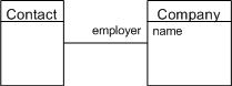
The important properties to note are:
-
caption - the caption to display on the picker dialog. This is the only property from the control that directly affects the pop-up dialog's display.
-
value - a complex attribute from the class to which the containing layout is bound. The attribute that is chosen, for example, employer which is an attribute on
Contact, of type Company. -
valueCaption - the caption for the type-ahead list (combo) and the displayed chip for the selected item. This is an attribute on the returned object as configured in the value property.
-
valueIcon - the icon for the type-ahead list (combo) and the displayed chip for the selected item. This is a set of image value pairs referring to image attributes on the returned object as configured in the value property. For example:
XML(image . (company image))(data . mimeData)(type . mimeType)(icon . (company icon))(default . "icon:client")
-
ref - a reference to the .picker declaration. The type of the .picker must work with the type of the value property.
If you type in the list, based on the configuration above, you get:
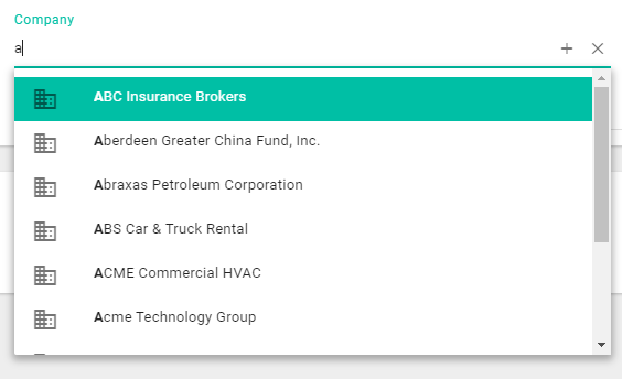
and a selected item will appear as:

Clicking the picker control's Select button, displays the picker dialog as declared in the .picker file with the caption, "Select a company", set by the picker control.
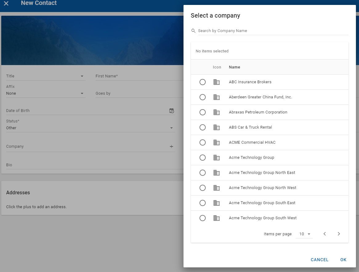
The drop-down list contains the user to selecting a single value, and the dialog does the same by using radio buttons rather than checkboxes. The platform knows the cardinality of the association; many (employees) to one (employer).
To learn more about the various properties of a picker control, see the Model Description Language Reference.
Related APIs
Picker (.picker file) declaration for single-item pickers
The declaration specifies the picker dialog's item creation behavior, sorting, searching, and row display style. This is the simplest sort of declaration, where you specify:
-
Class - the class from which you pick instances.
-
Captions - the caption for each item in the list to display.
-
Icons - the icon to display in the list if the class has an icon or image attribute. This is a set of image value pairs referring to image attributes on the items in the list. For example:
(image . (company image))(data . mimeData)(type . mimeType)(icon . (company icon))(default . "icon:client")
-
Order - the default sort order.
-
Search - the attribute to use for filtering the picker list.
The following example is for the Company class:
<Picker
captions="lastName"
class="Company"
icons="(image . image)(data . mimeData)(type . mimeType)(icon . icon)(default . "company")"
order="((lastName . #t) ((@) . #t))"
search="fullTextSearch"
/>
and is rendered as follows when invoked by picking a company for a person.

Additionally, for single-item pickers, Mode may be used to satisfy use cases that need a filtered list. Here, you create a number of modes in the Picker declaration with different where clauses that can be applied. For example, a picker control may have mode="activeClients" to filter for only those companies that are active clients in a particular layout.
Documentation on the various properties of a .picker declaration is available in the Model Description Language Reference.
The page (23.11) Multipicker was not found -- Please check/update the page name used in the MultiExcerpt-Include macro
Scheme scripting in pickers
The page (23.11) Multipicker was not found -- Please check/update the page name used in the MultiExcerpt-Include macro
Other considerations
Enumeration pickers
Although enumerations can be rendered as pickers, designs usually dictate that they are rendered as combo controls. It is uncommon for enumerations to be rendered as pickers.
That said, declaring a picker for an enumeration is straightforward. The following example is for the Country enumeration class.
<Picker captions="caption" class="Country" order="(displayOrder)" search="caption" values="value"/>
It is rendered as:
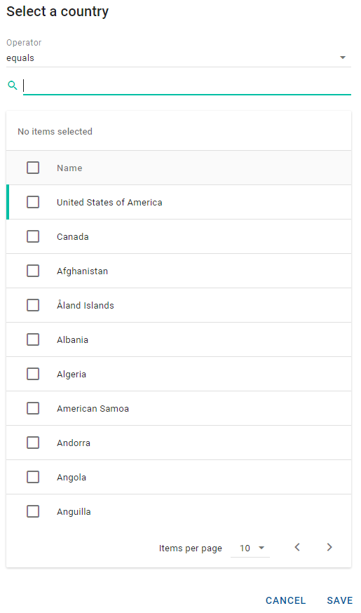
To change a caption for an enumeration picker in NexJ Studio, open the enumeration file in finance/meta/enumerations, edit the Caption value in the Locales section, and perform an upgrade load step.
The page (23.11) Multipicker was not found -- Please check/update the page name used in the MultiExcerpt-Include macro
Related links
-
Working with pickers (in the Learning Center)
-
Picker Control and Picker file (in the Model Description Language Reference)