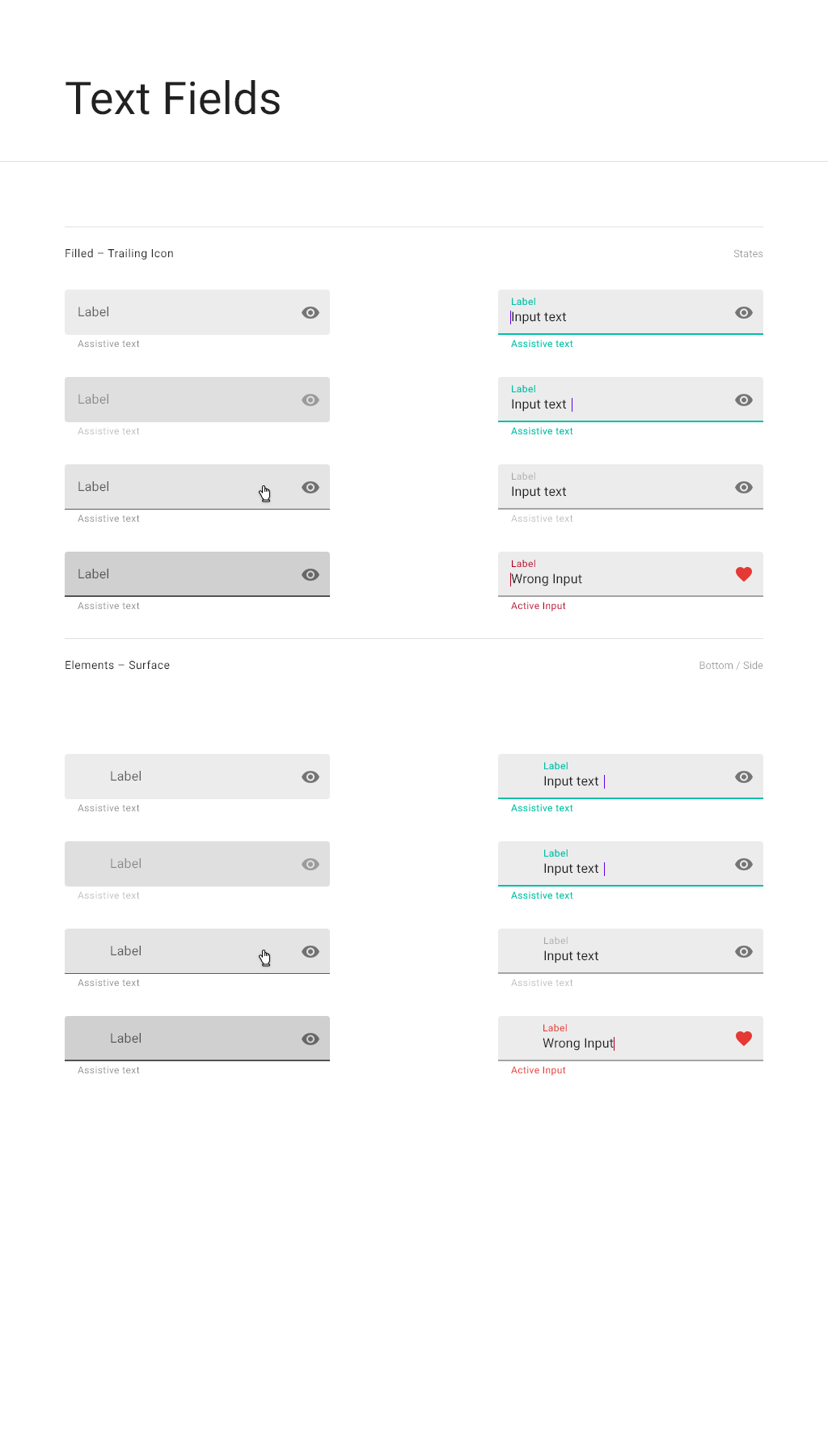
Text fields
Description
Use text fields to allow users to input text, in a variety of formats, including numeric, time/date, or currency. They can also use text fields to select a value from a limited set of options. In addition, the open search field is a text field.
When to use
Support typeahead for any text field where there is a finite set of possible options, but it is possible to add another value to the set of options.
Where the input field can accept multiple values, the set of values is finite, and no new values can be added, consider using chips for selection instead of a dropdown menu.In addition, a menu may be opened from a settings or options button.
Variations
If the text field input is time or date, include the clock icon in the text field. If there is a finite set of values associated with the field, include the down chevron icon in the text field. If the text field is being used for a search, include the search icon to the left of the field and appropriate ghost text in the field itself. Additional labels for search fields are not required.
Interactions
For time and date input, type the values in the text field or click the clock icon to open the date and time picker dialog.
For a dropdown input field, start typing the content and then select the value from the options below or click the down chevron to open the complete list of options.
If a required field has not been completed or has been completed incorrectly, display the error below the text field in conjunction with a banner on top of the dialog.
Specifications

Detailed specifications
| Element | Active state | Inactive state | Disabled state | Error state |
|---|---|---|---|---|
| Label text size | 12pt | 14pt | 14pt | 12pt |
| Label text and line color | Accent (#00bfa5) 100% | Black (#000000) 54% | Black (#000000) 37% | Red (#e53935) 100% |
| Assistive/error text size | 11pt | 11pt | 11pt | 11pt |
| Assistive/error text color | Accent (#00bfa5) 100% | Black (#000000) 54% | Black (#000000) 37% | Red (#e53935) 100% |
Padding between inactive/disabled fields is 41px. Padding between active fields is 16px.
